Client
Broomwagon Coffee
Experience Created
Brand / Packaging
Broomwagon Coffee came to Caava for a brand identity and packaging system that could bring together two distinct cultures: small-batch coffee roasting and classic cycling.
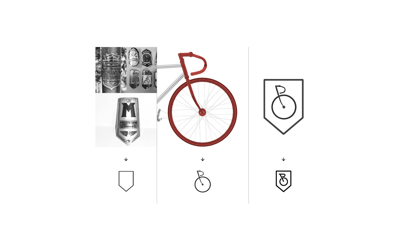
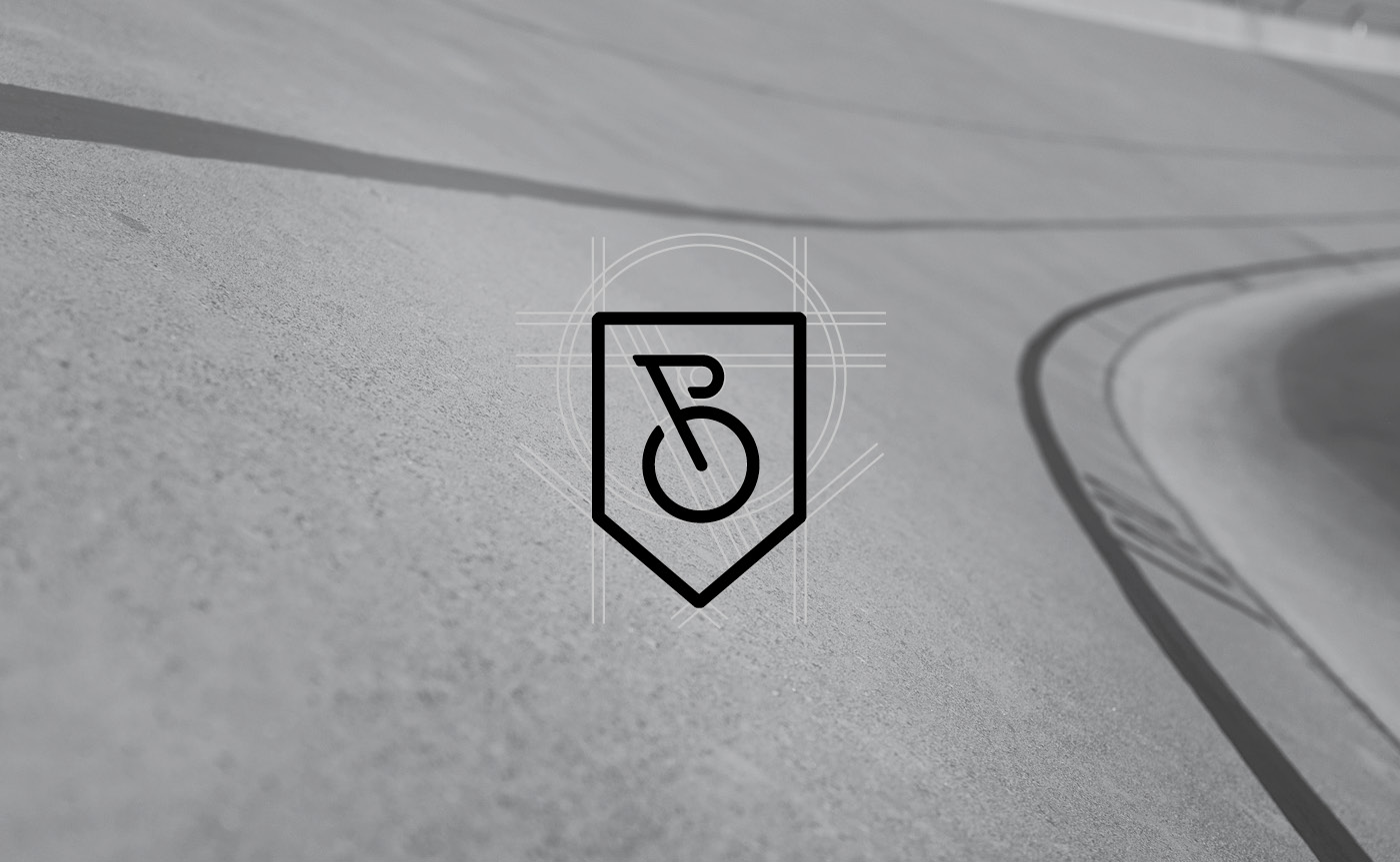
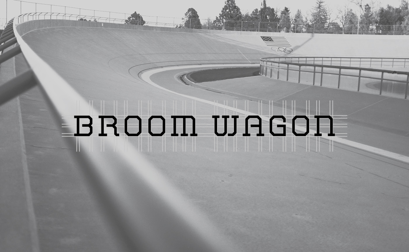
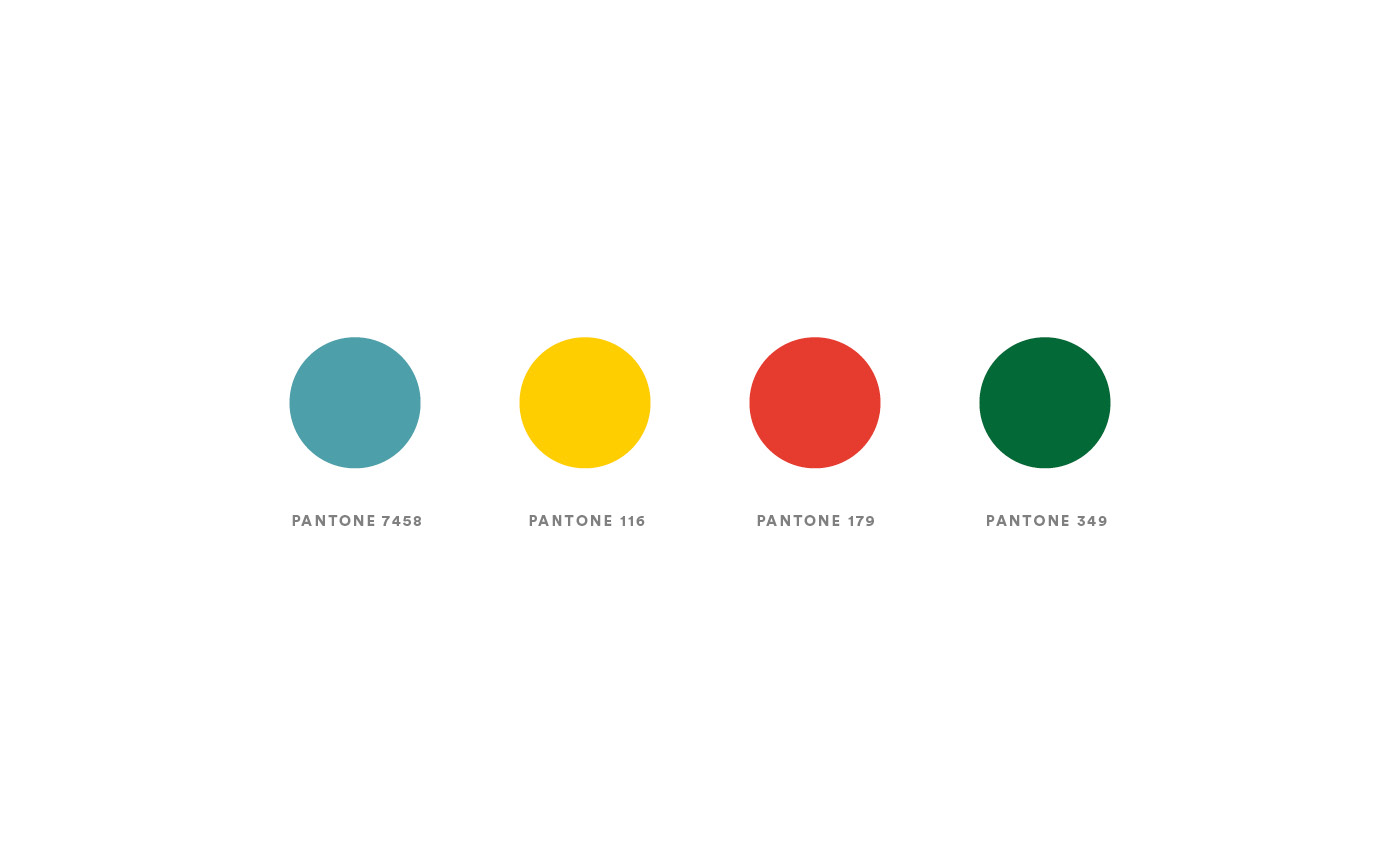
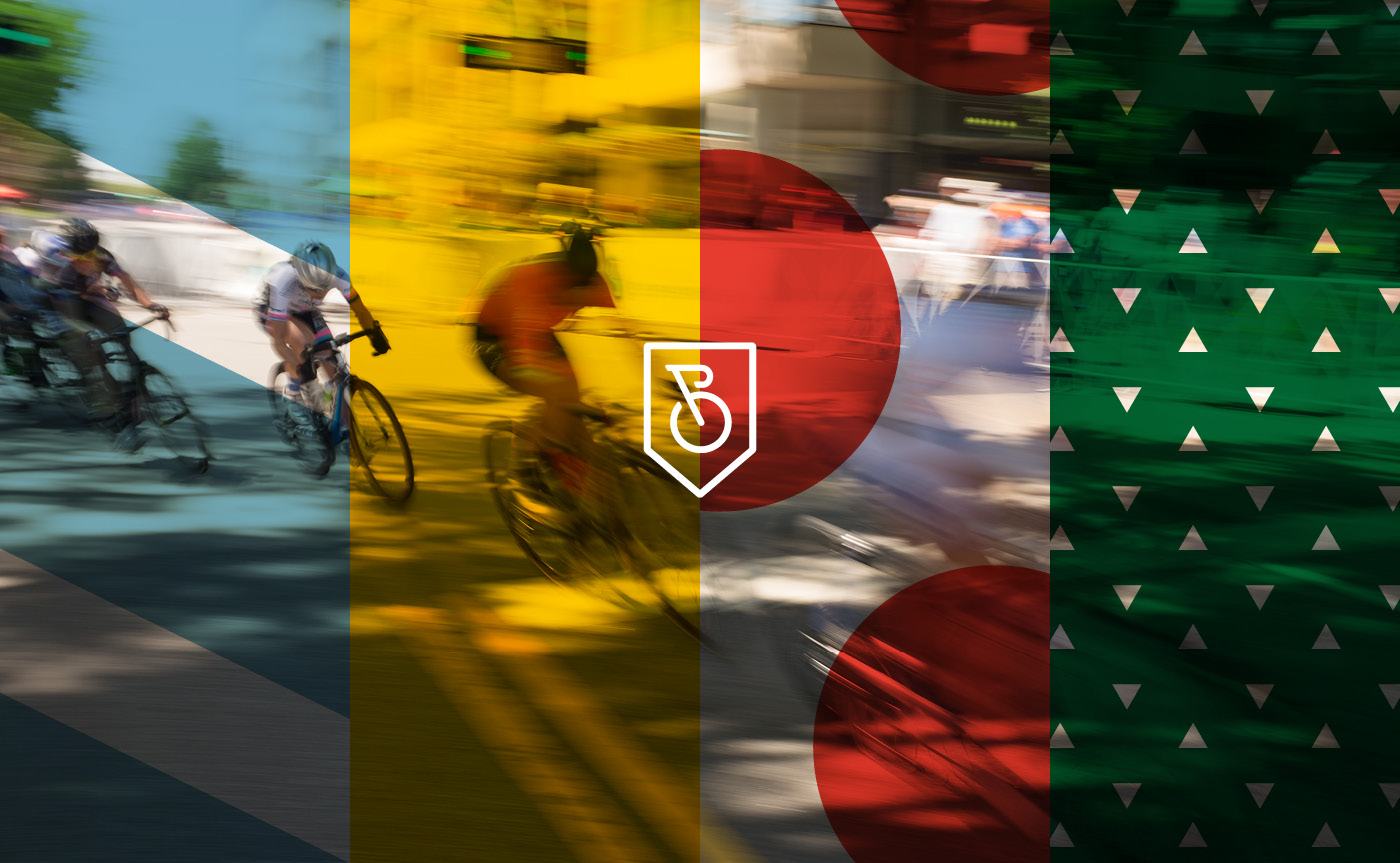
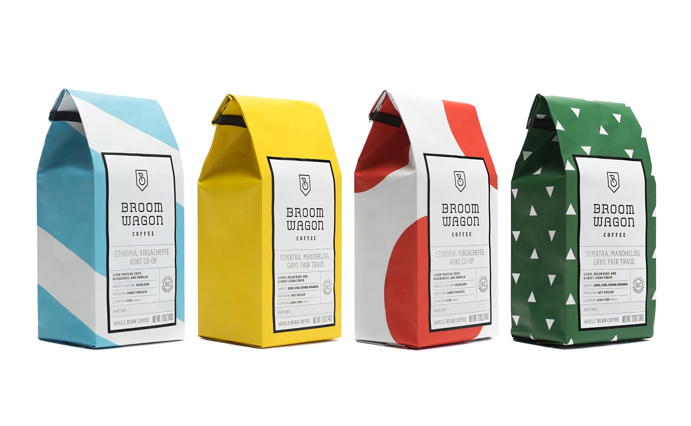
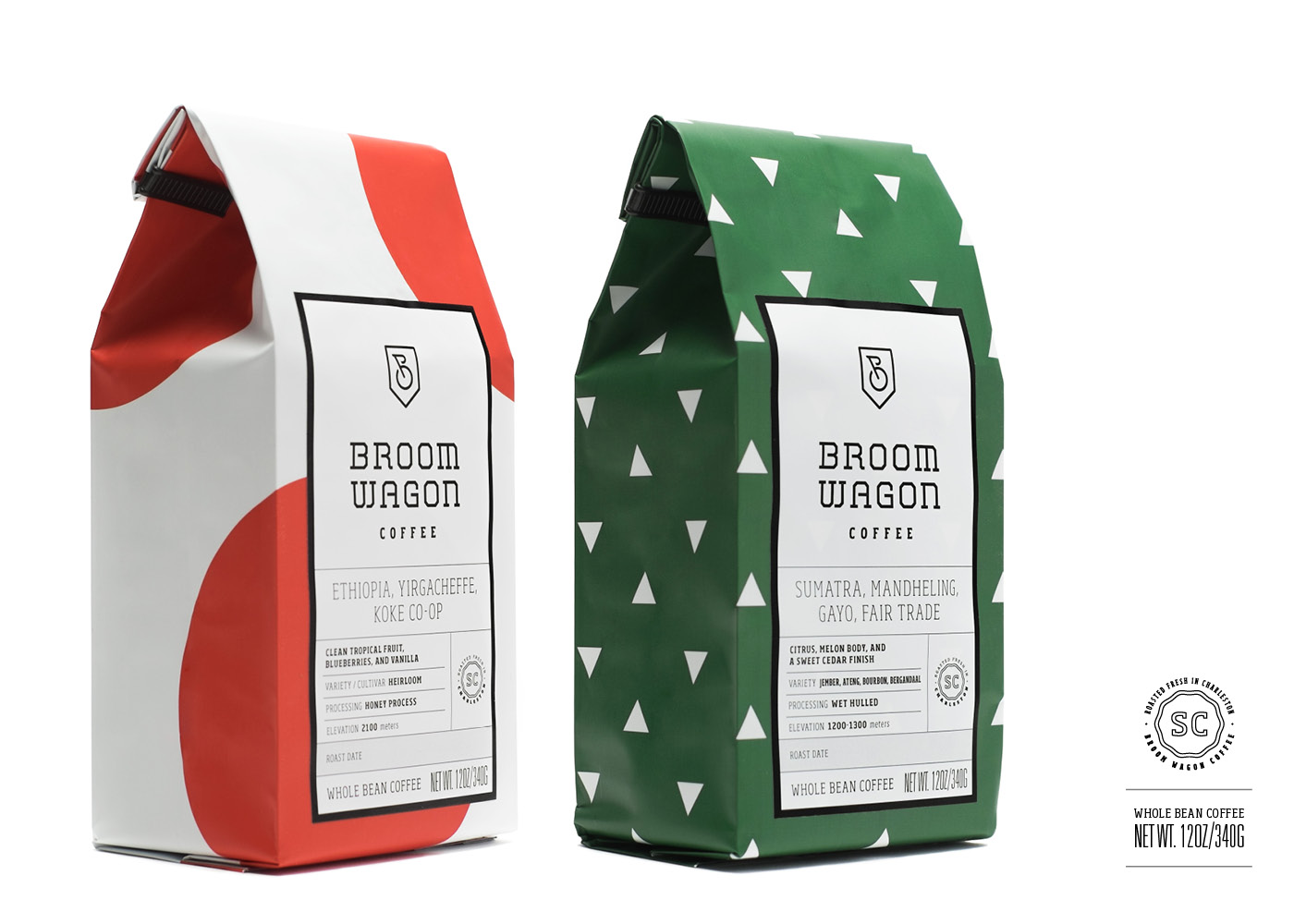
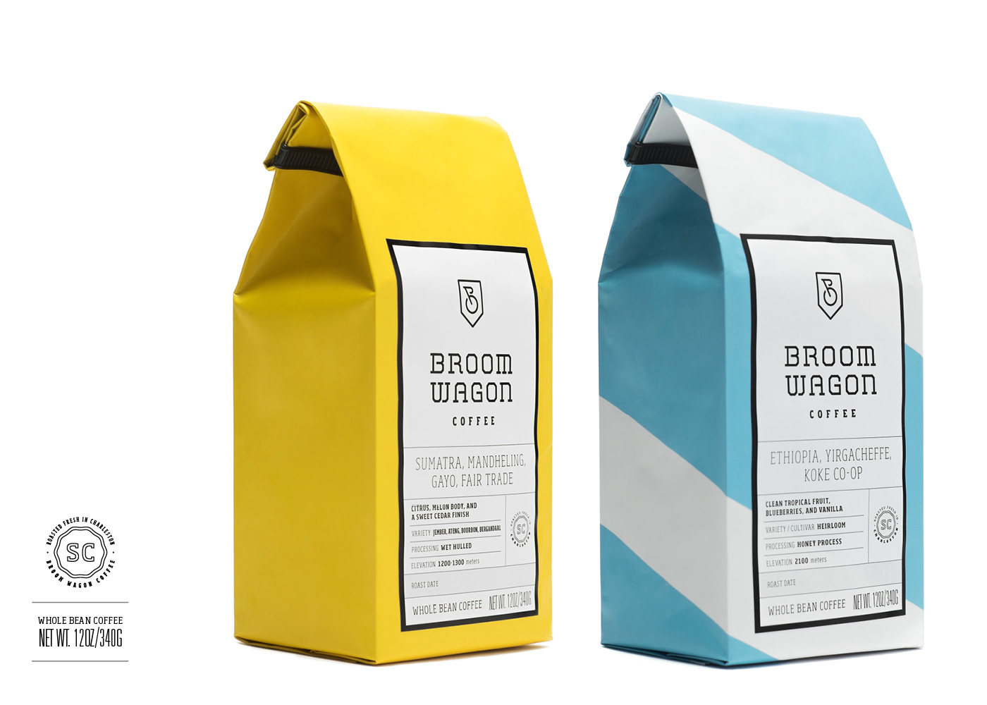
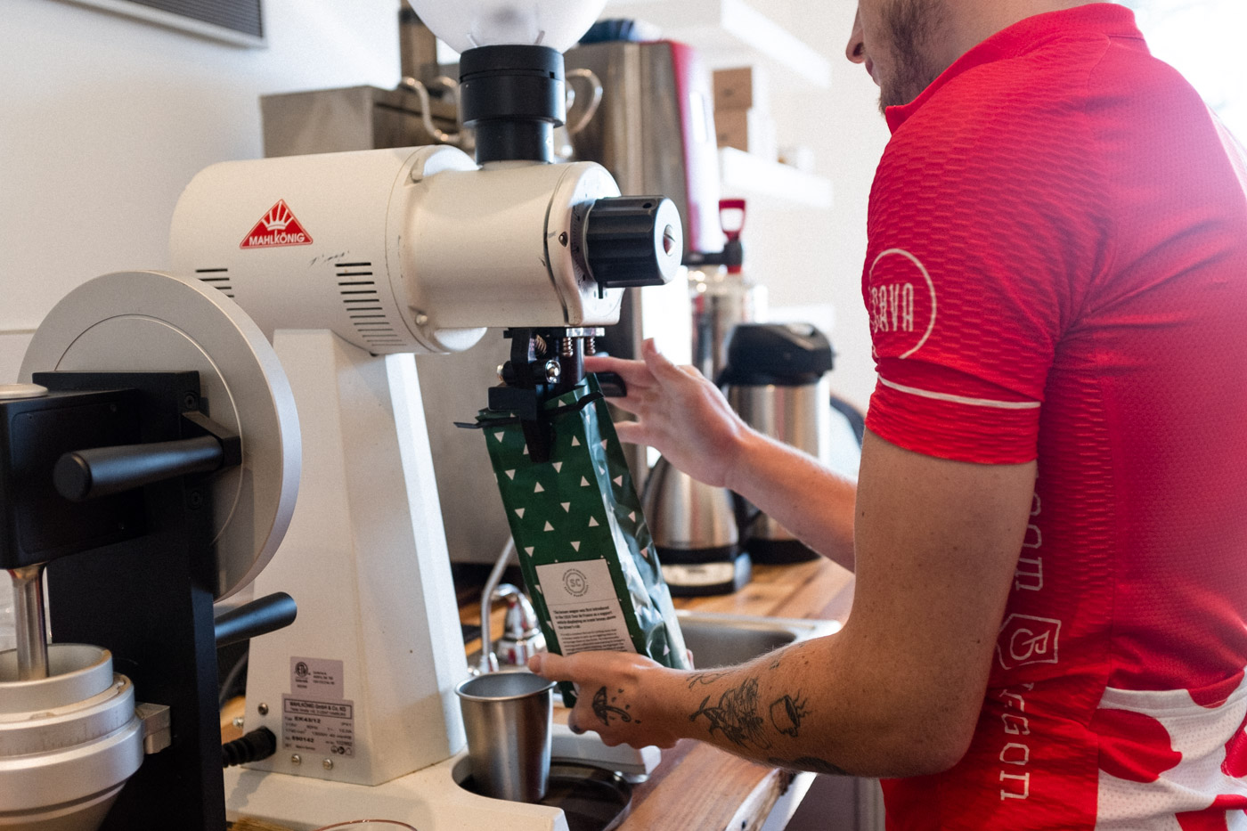
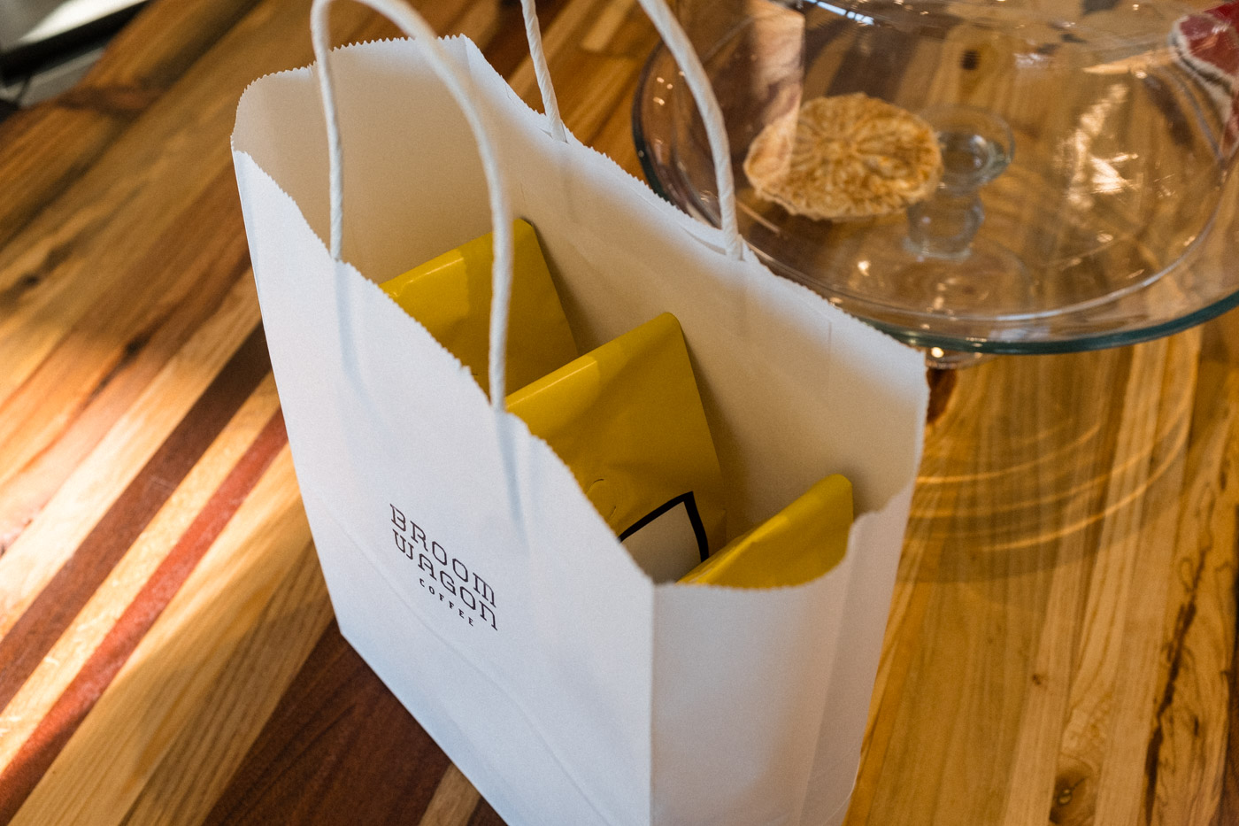
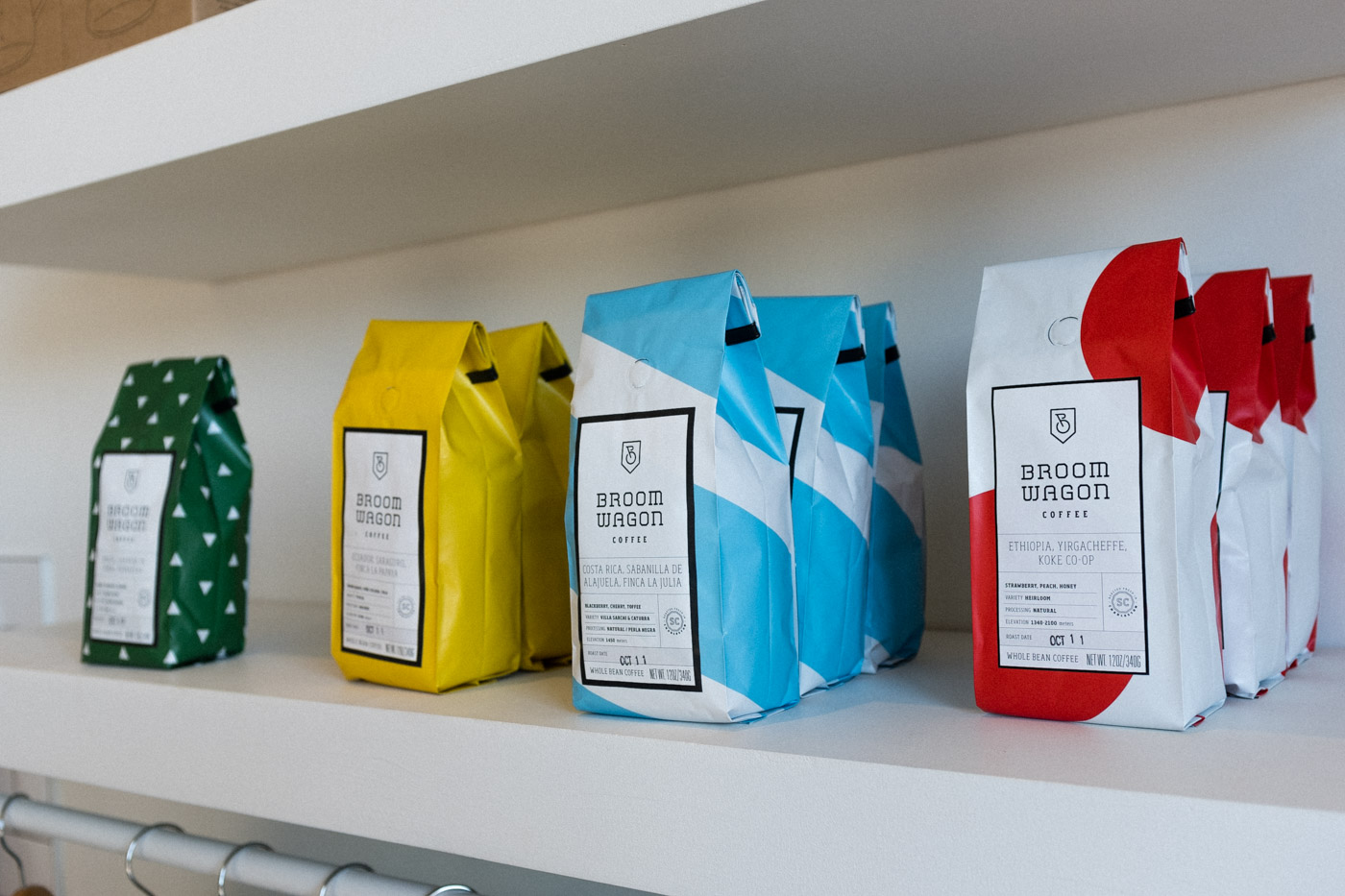
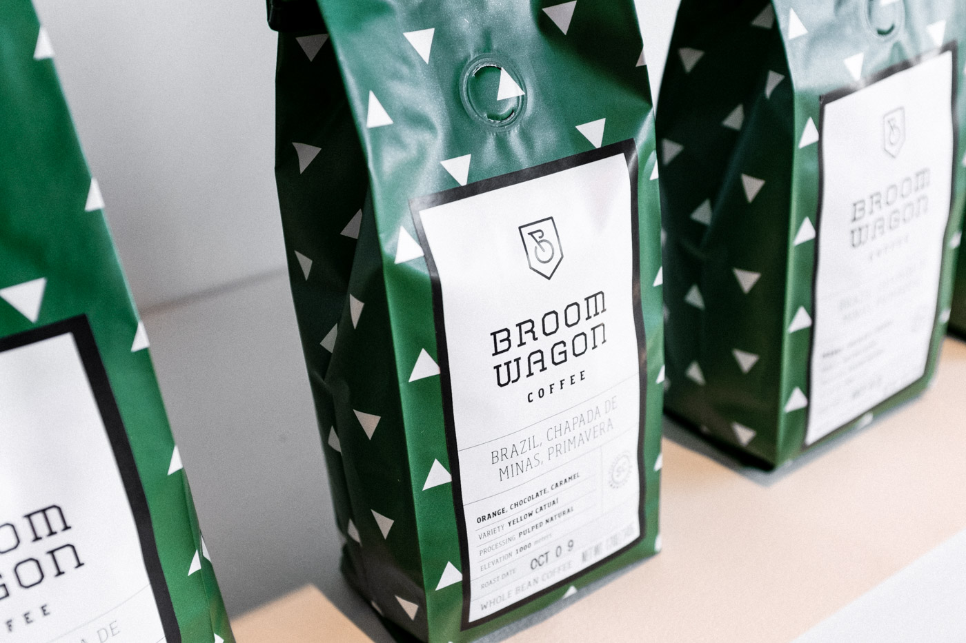
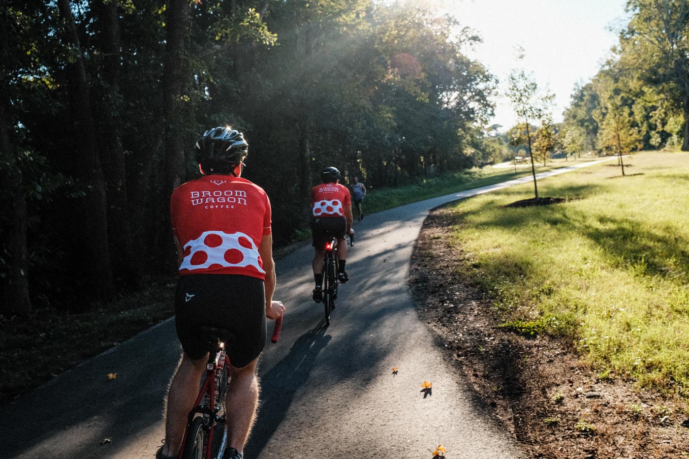
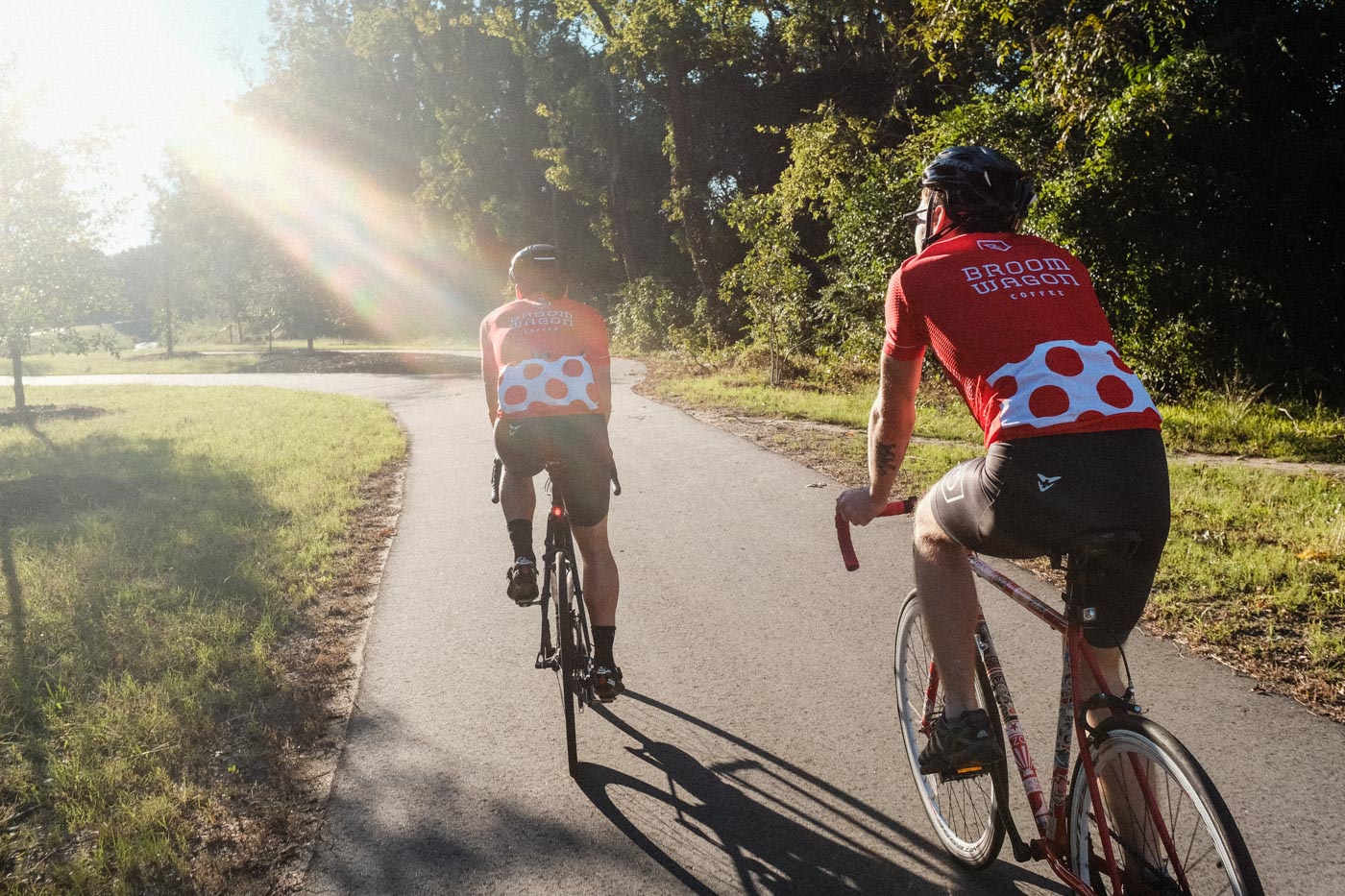
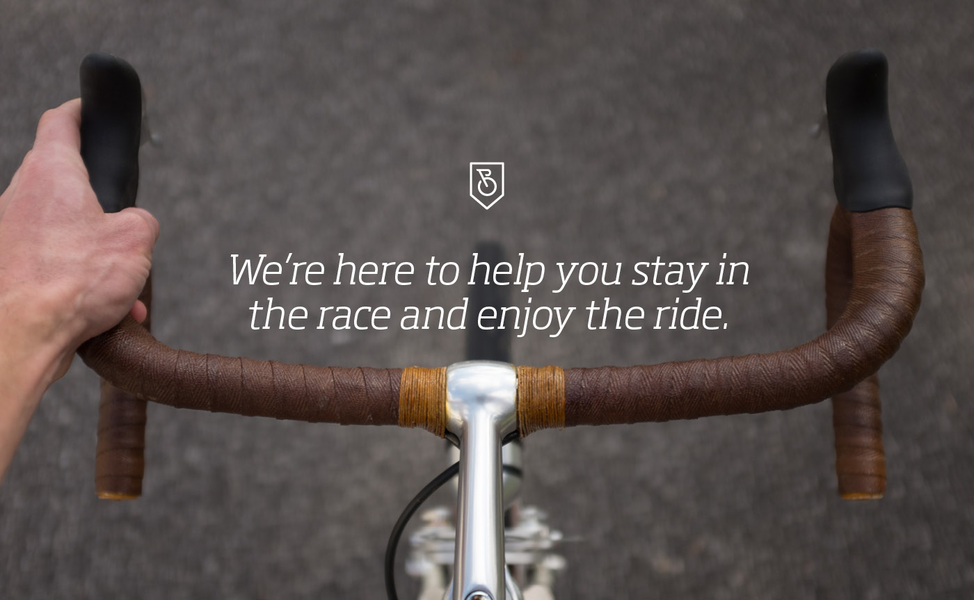
We built the identity around visual cues familiar to cyclists without turning the brand into cycling memorabilia. The logo mark draws from classic bicycle shields, with the “B” doubling as the front portion of a bicycle. Custom typography references the angular, athletic lettering found on vintage rides, while the coffee bags take inspiration from the colors and patterns of Tour de France classification jerseys.
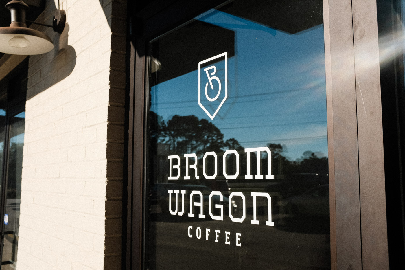
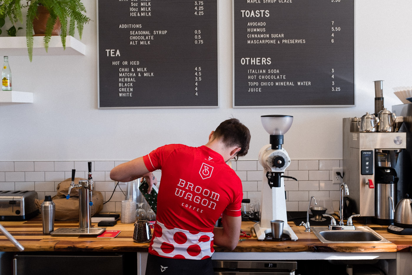
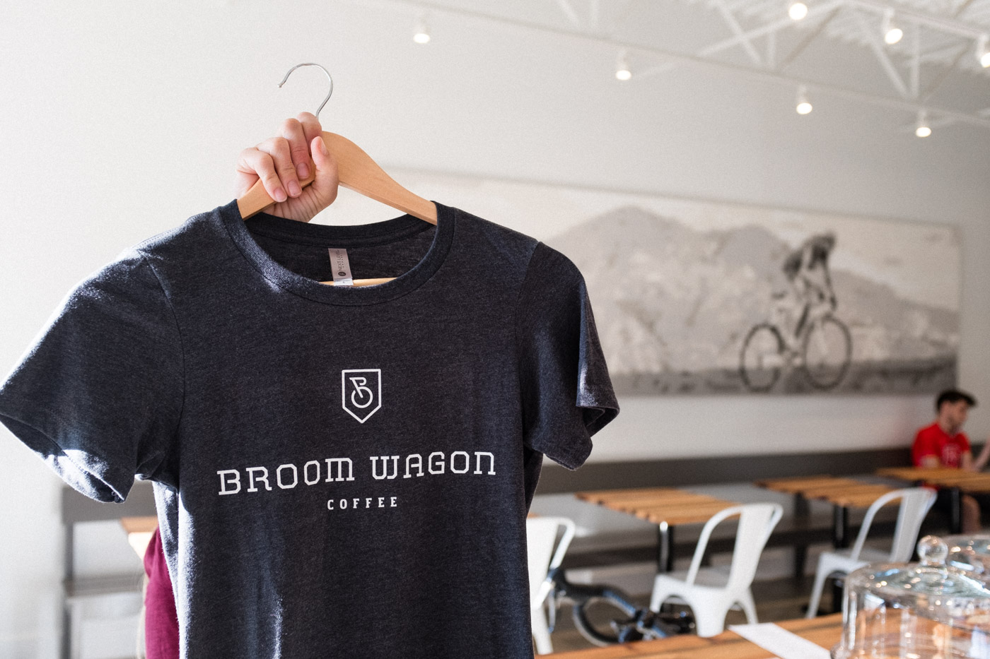
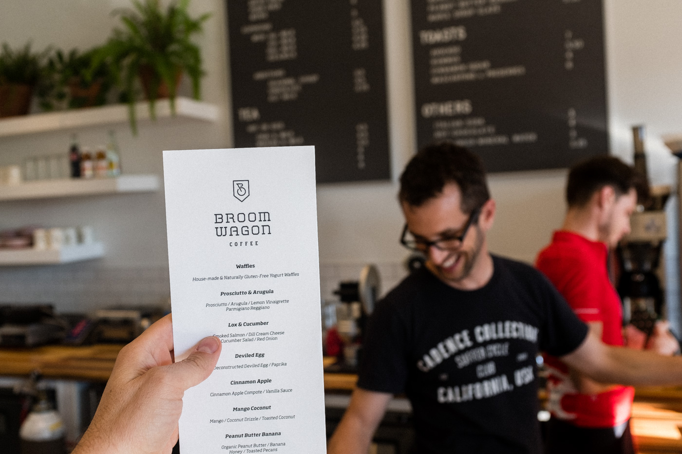
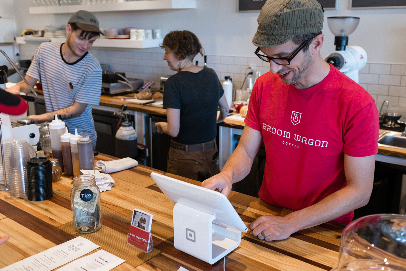
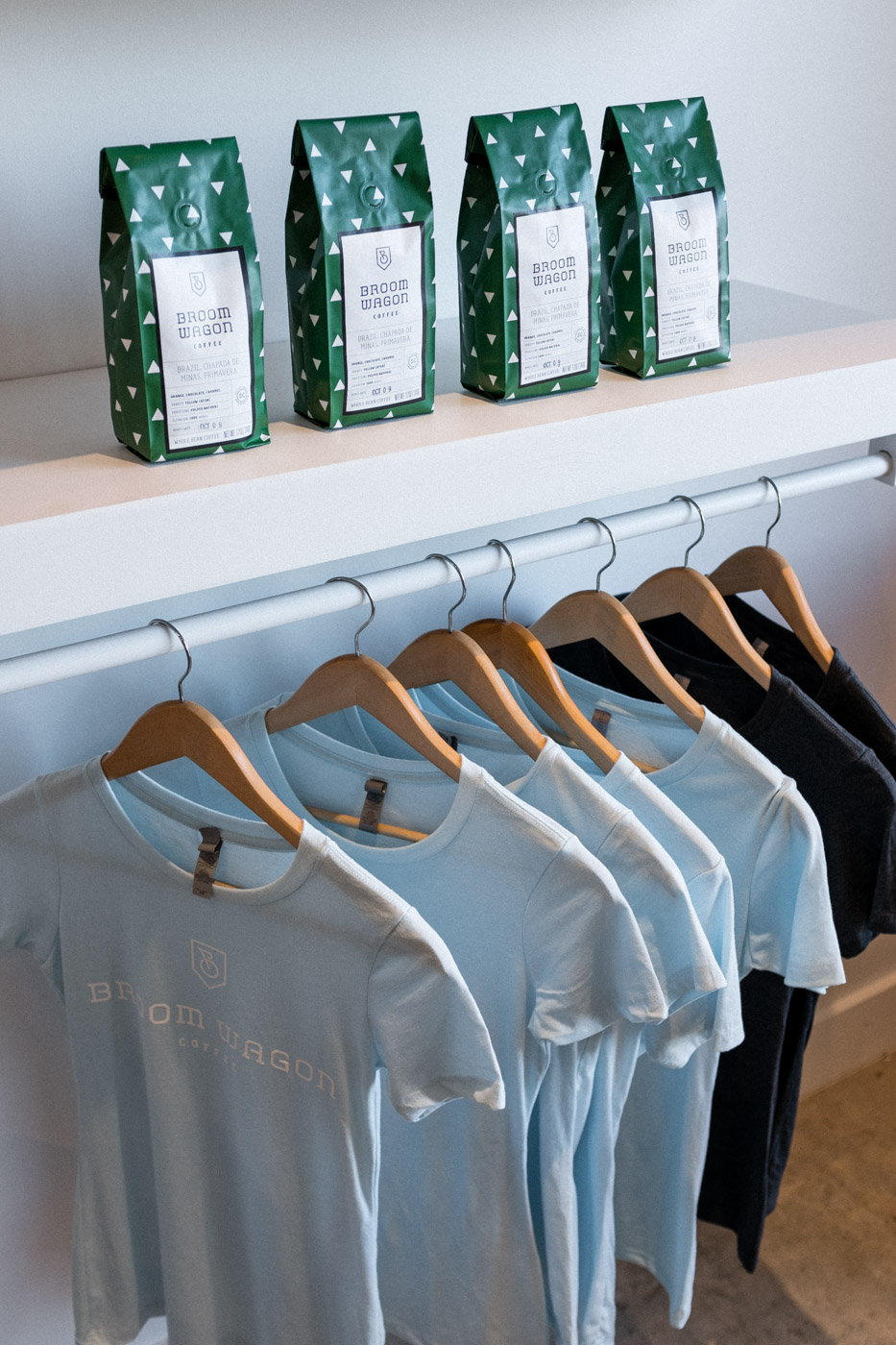
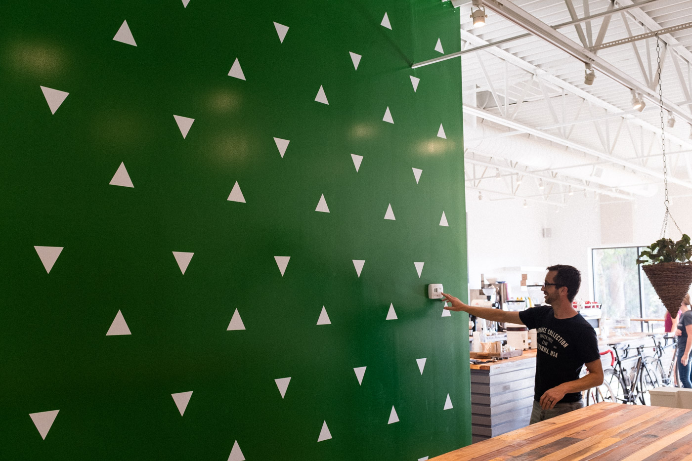
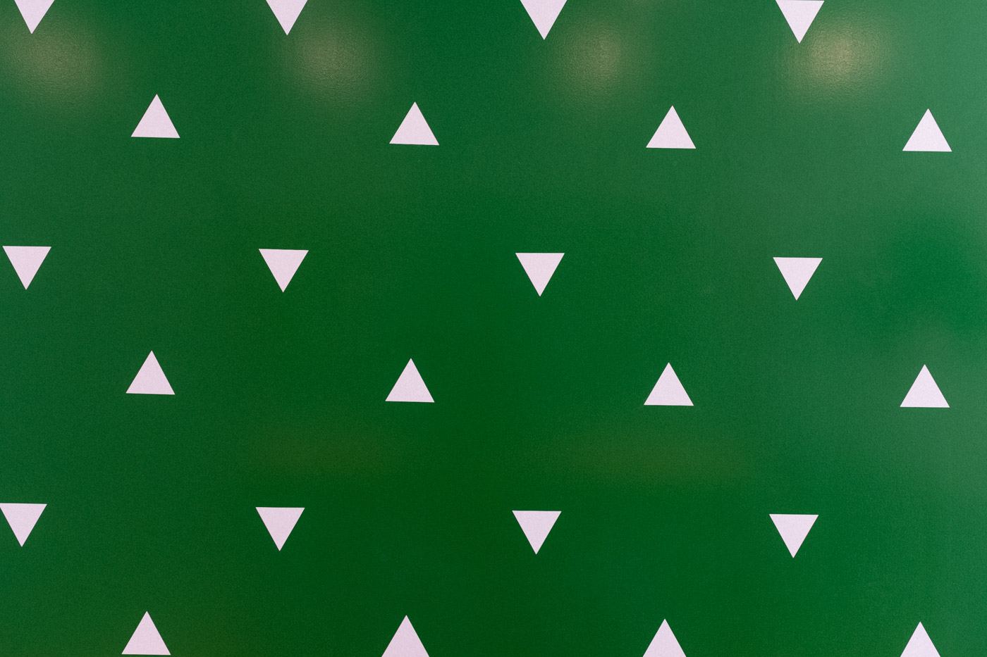
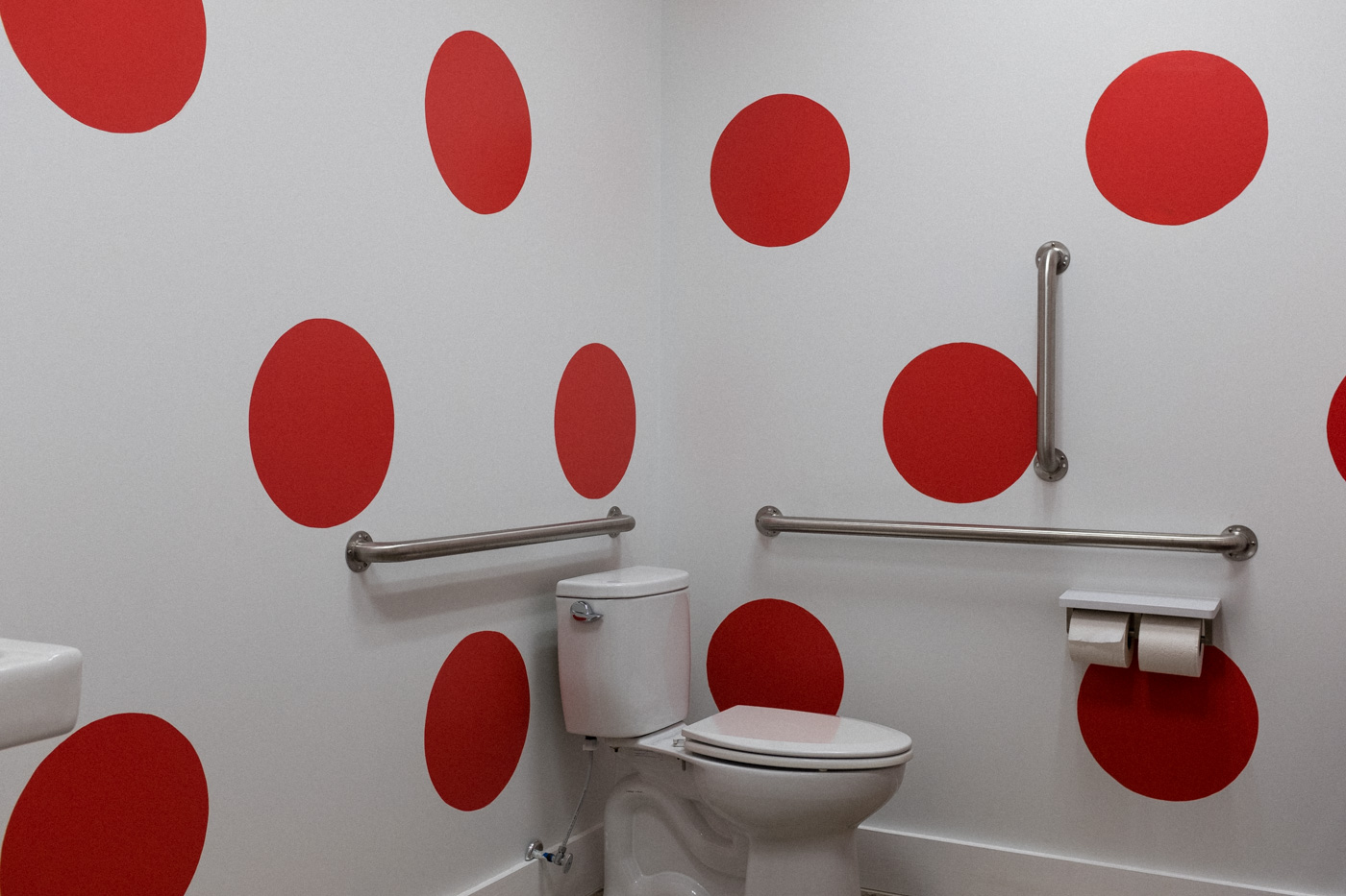
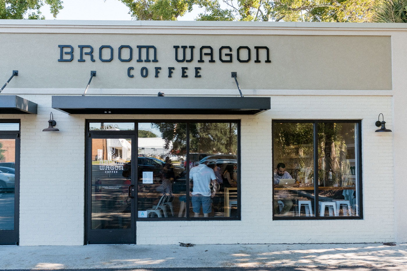
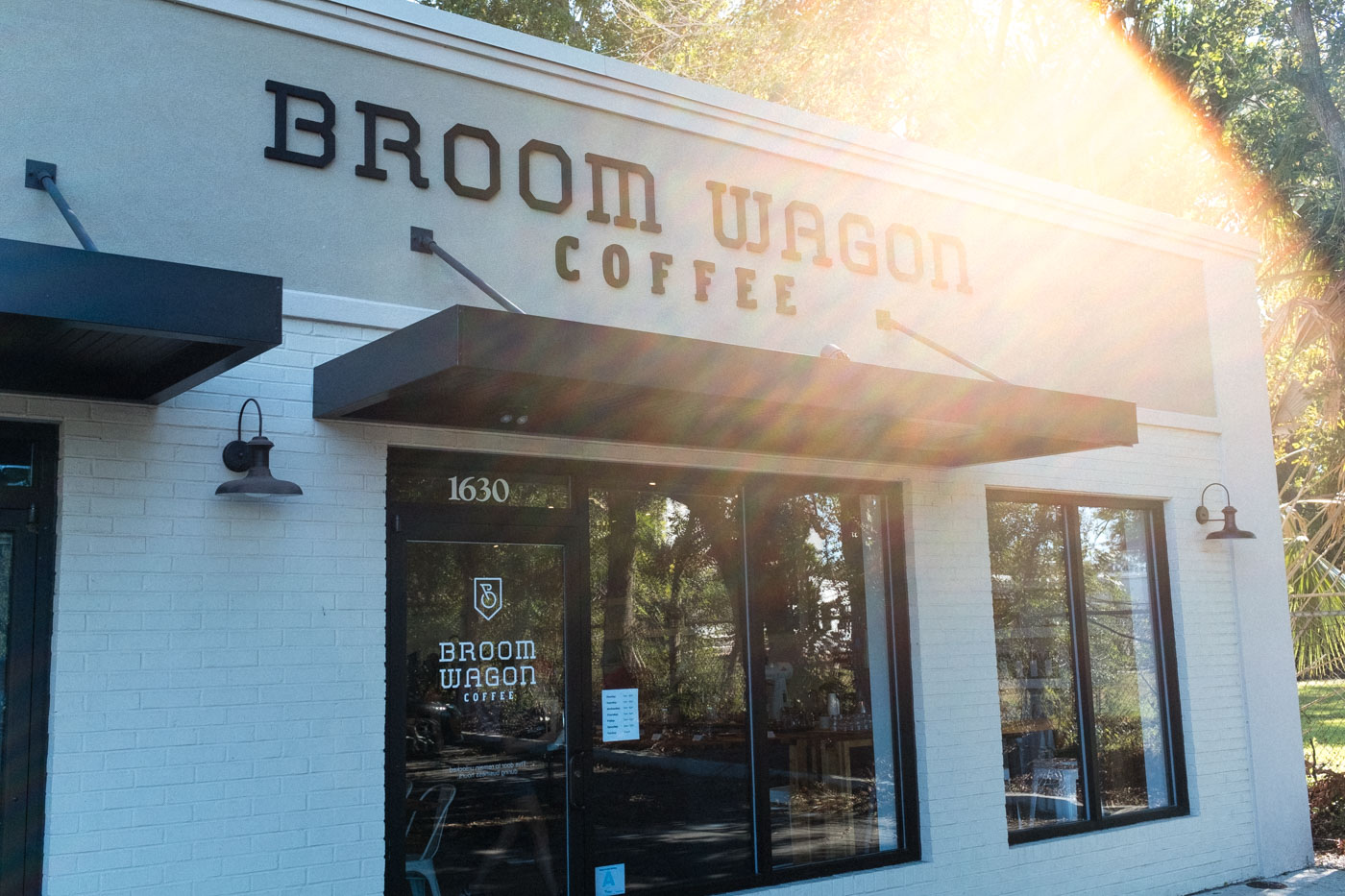
The system extended beyond the package into Broomwagon’s South Carolina café, creating a cohesive environment for a business that has become a gathering place for cyclists and coffee lovers alike. The project demonstrates how a specific cultural insight can become a flexible brand system rather than simply a graphic theme.
LOGO MARK INSPIRATION
LOGO MARK
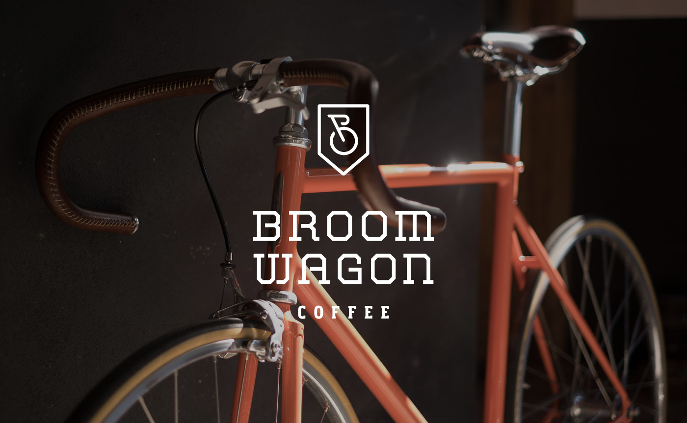
PRIMARY LOGO
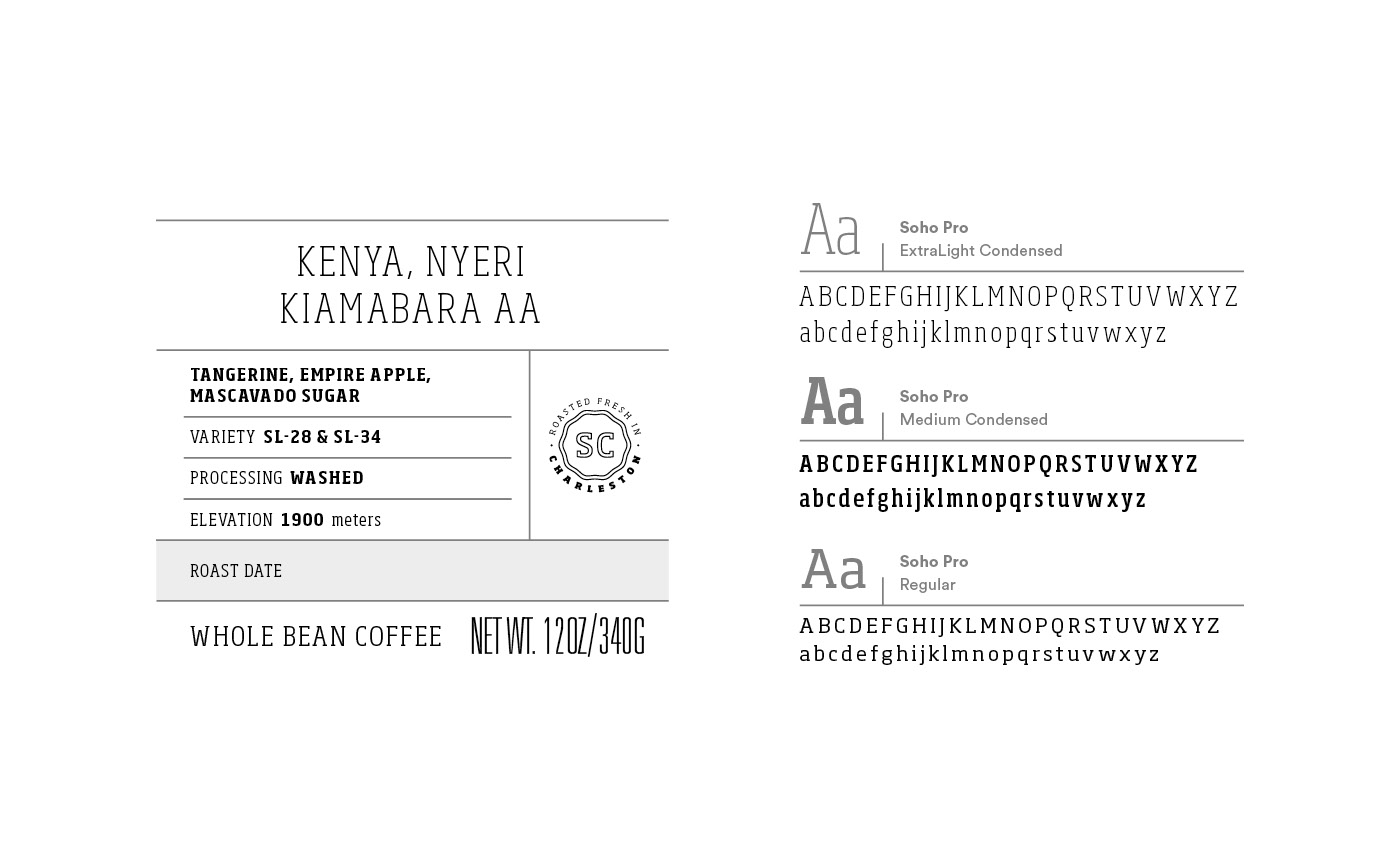
CUSTOM TYPOGRAPHY
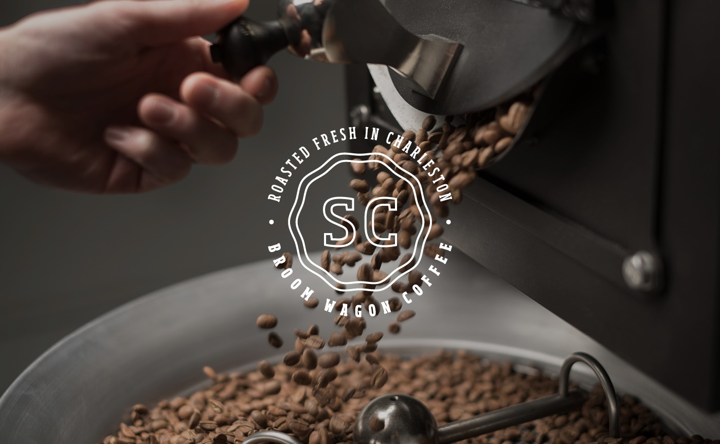
LOCATION MONOGRAM
TYPOGRAPHY
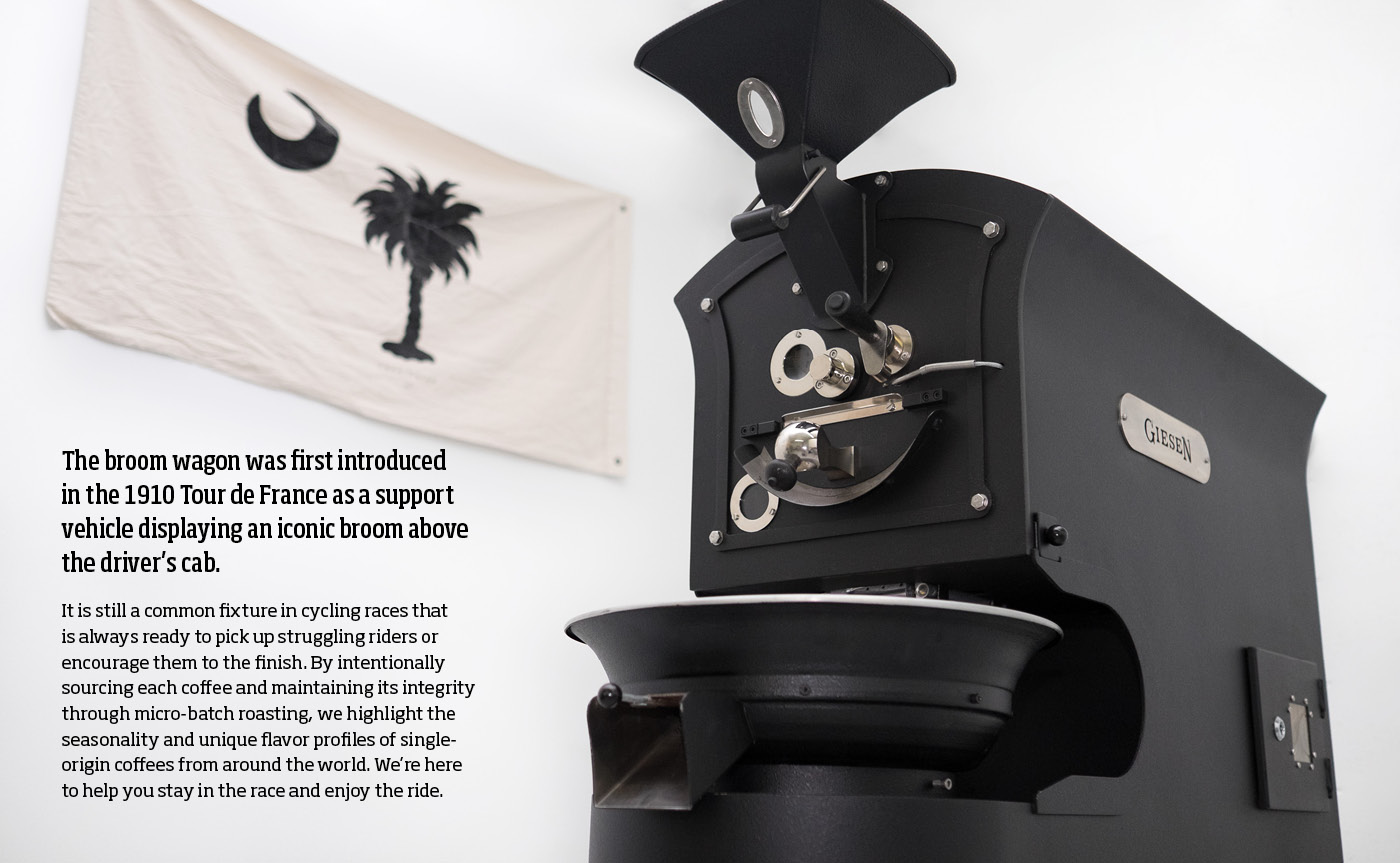
STORY
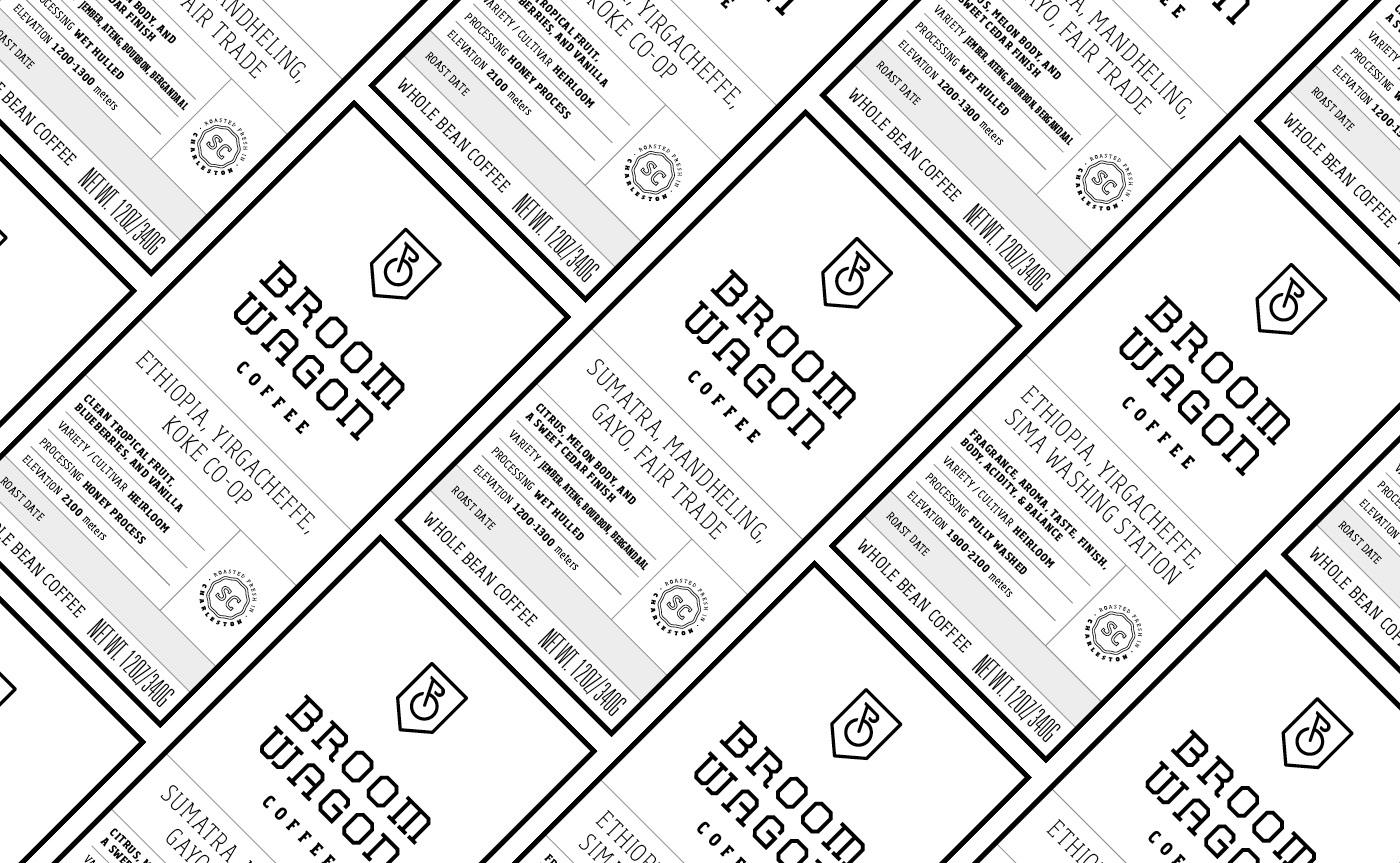
LABEL SYSTEM
COLOR PALETTE
BAG DESIGN
THE CAFE

RESULTS
More than a coffee brand. A place people wanted to gather.
Broomwagon’s identity succeeded because it felt native to both sides of the business: serious coffee and cycling culture. The visual system translated that overlap into something distinctive without becoming cycling memorabilia, then extended naturally from the coffee bags into the café itself. What began as a brand and packaging project helped create a recognizable gathering place where cyclists and coffee lovers could feel equally at home. The result was more than a visual identity or a package on the shelf. It became a brand people could participate in and a community they could become part of.