Client
Host & Porter
Experience Created
Brand / Packaging / Web
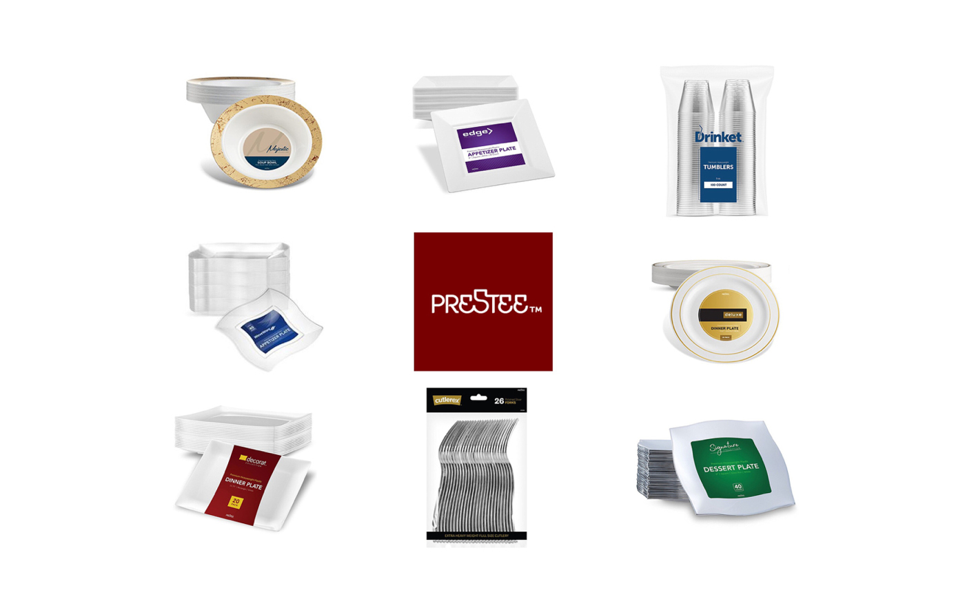
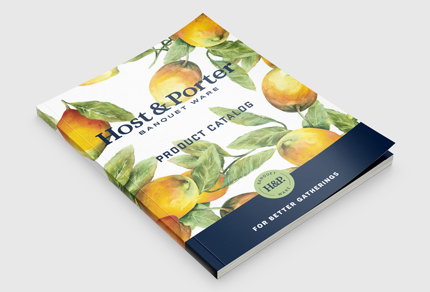
The New York based Prestee approached Caava Design to unify their massive product lines into one overarching corporate brand. After renaming the business to Host & Porter Banquet Ware, we created a visual design system for the company that has a high end sensibility with a clean and clear communication strategy. Host & Porter’s packaging system is infinitely expandable, adaptable, and easy to understand from a distance. With 26 different product styles and over 450 unique items, this packaging solution sets the newly named Host & Porter up for success in any retail environment. The rebrand and product line caught the attention of various big box retailers and has set the business on a new course of success.
OLD BRAND
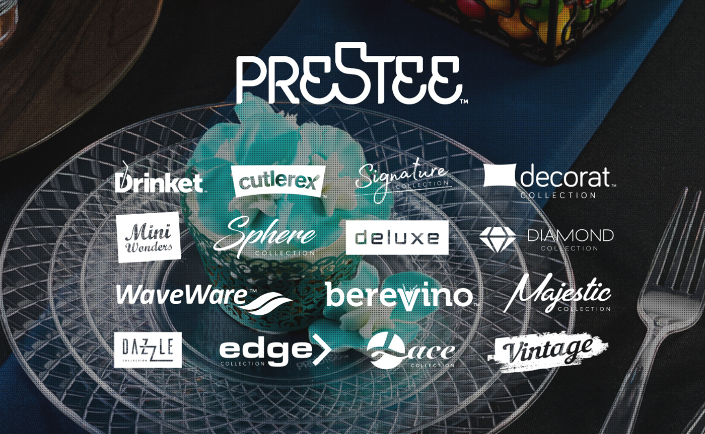
OLD PACKAGING
Strategy + Branding
Developing the new name.
As part of the new brand, Prestee asked us to rename their company. Based on our previous experience we developed a naming strategy based on the following criteria: it should be easy to remember, feel like it belongs to the product category, look good visually & be easy to pronounce, and must be unique to the market. Host & Porter achieves these goals while also adding an additional layered meaning. Those who buy H&P believe in being good hosts and providing a sophisticated experience. Much like Williams Sonoma, West Elm, and Crate & Barrel – the name carries a refined sensibility which easily lends itself to a family of subsidiary product lines. When a guest asks, “where did you get these plates” customers will be able to say “oh thank you… these are Host & Porter”.
PRIMARY LOGO
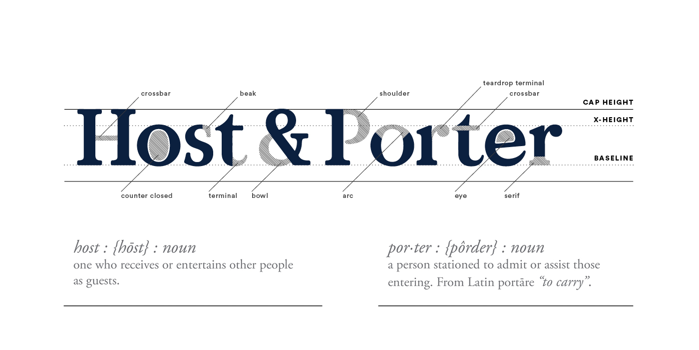
LOGOTYPE ANATOMY

TYPOGRAPHY
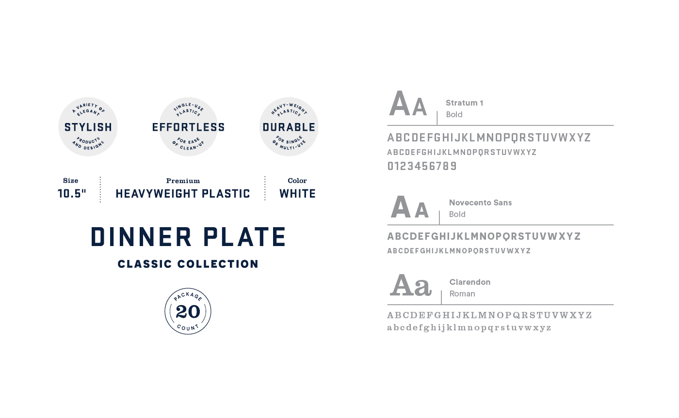
packaging system
Creating an adaptable packaging system.
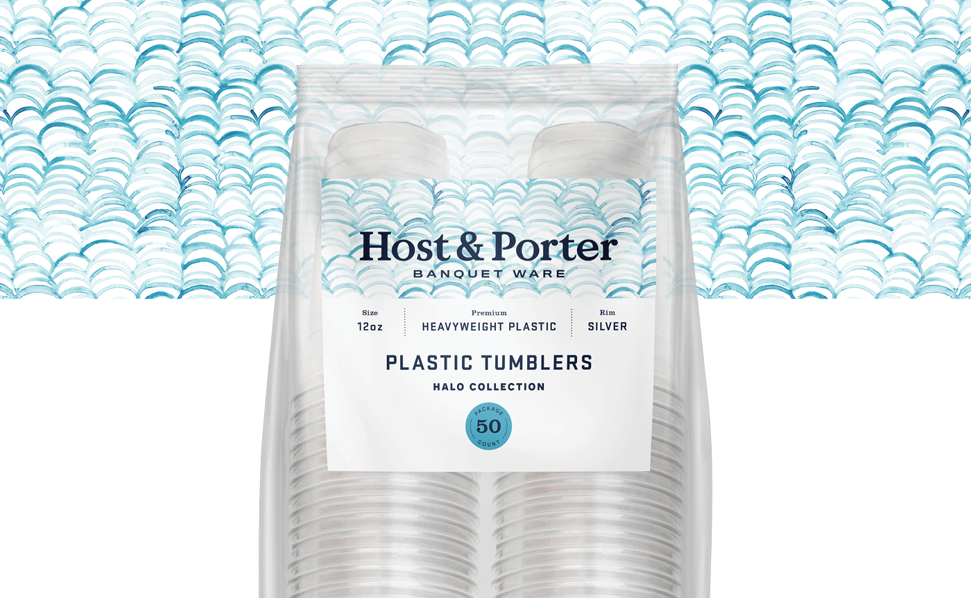
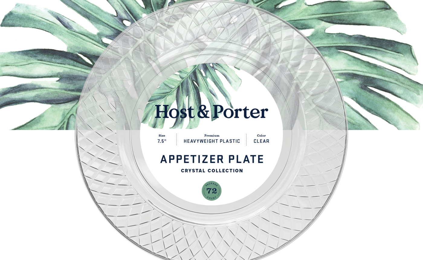
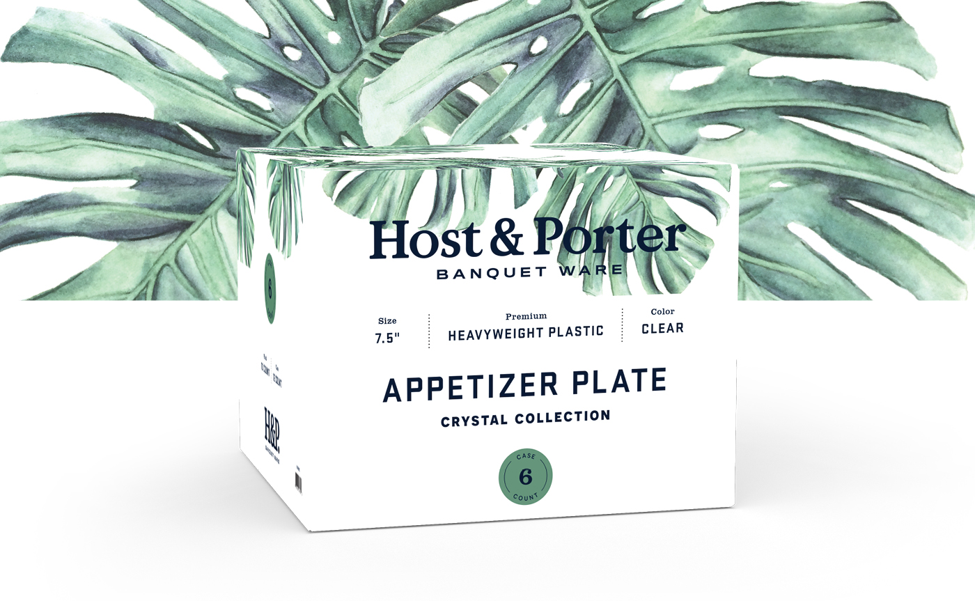
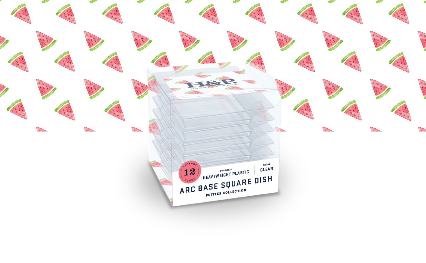
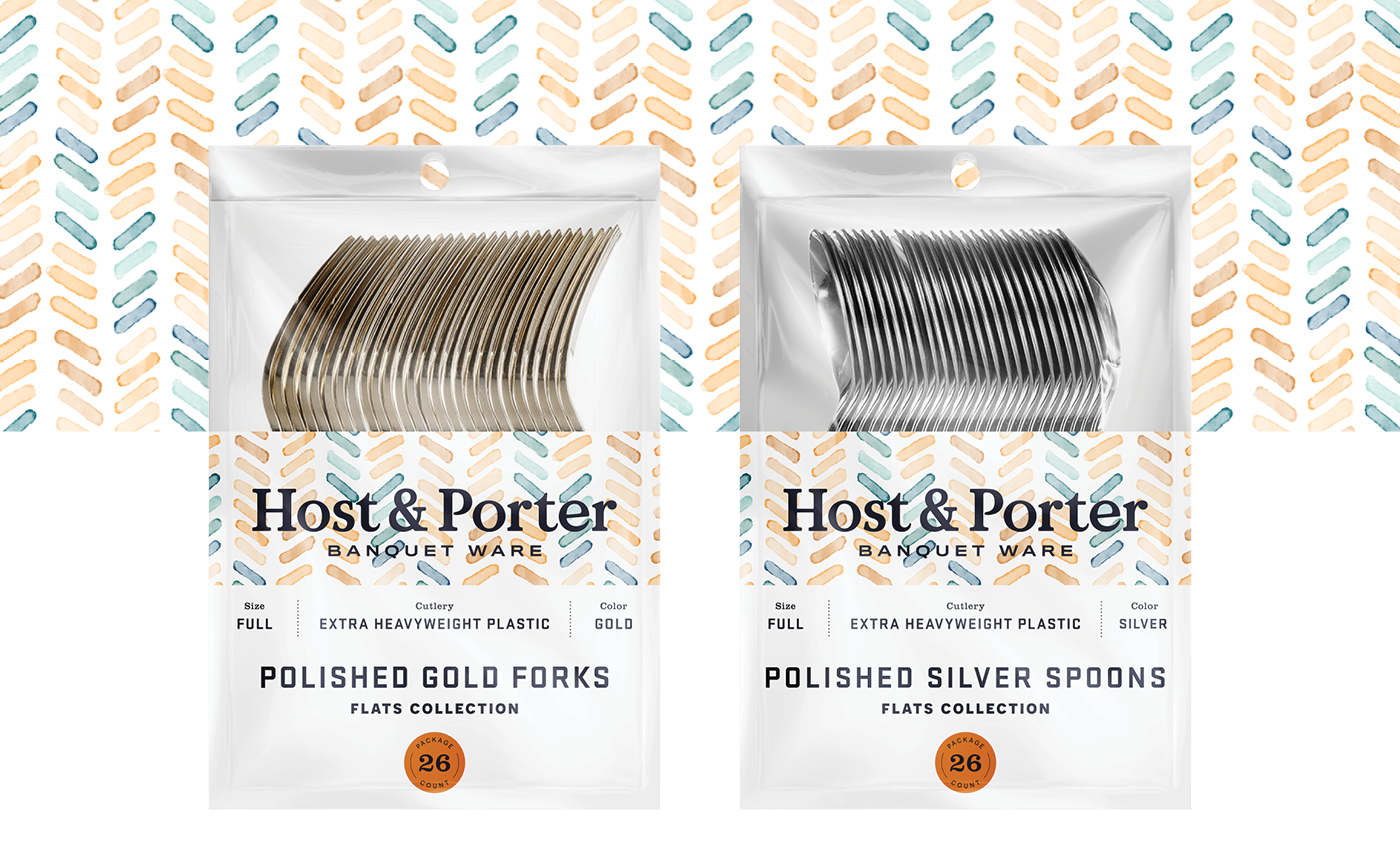
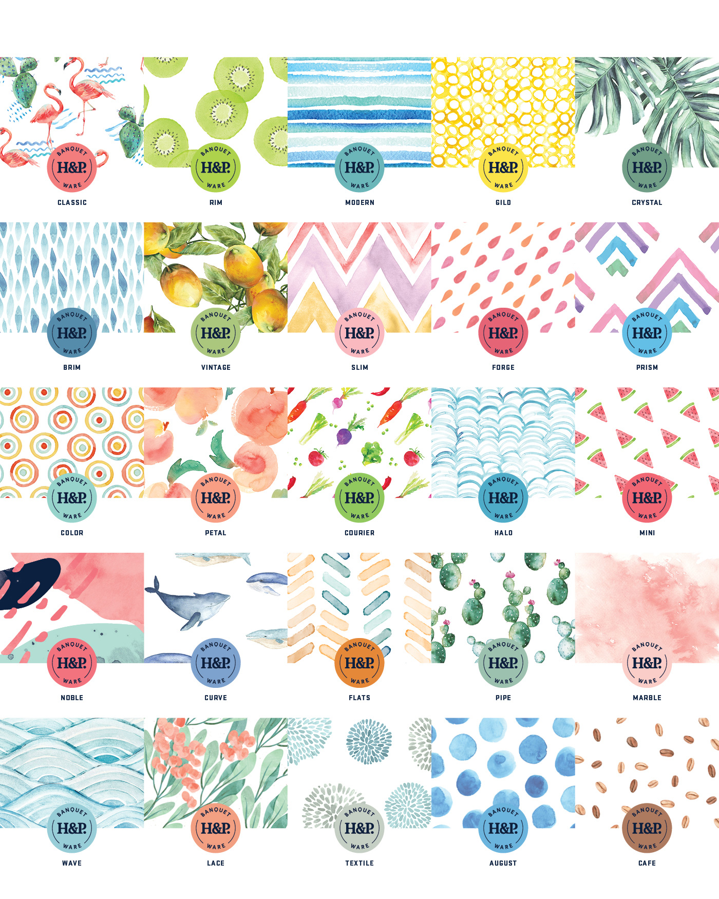
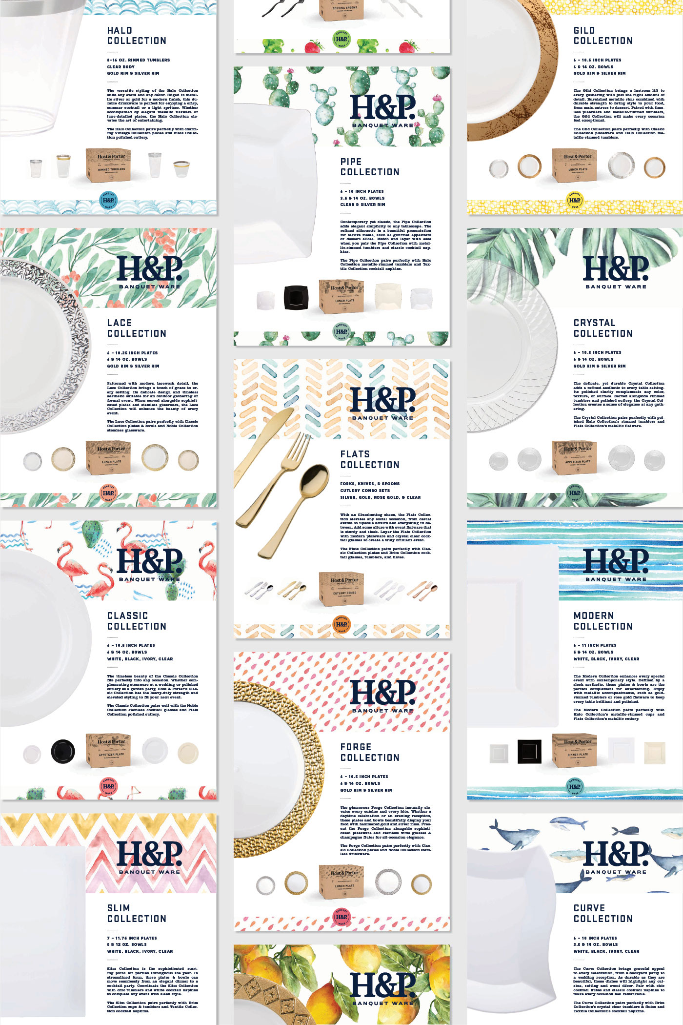
Unifying 26 collections and 450 items was a challenge when developing the packaging solution for Host & Porter. By incorporating consistent typography, unique patterns, and a wide color palette we were able to develop an infinitely expandable system where each product family has its own identity while remaining united under the H&P brand.
PATTERN SYSTEM AT A GLANCE
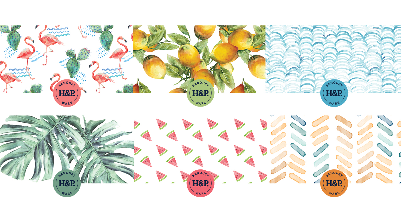
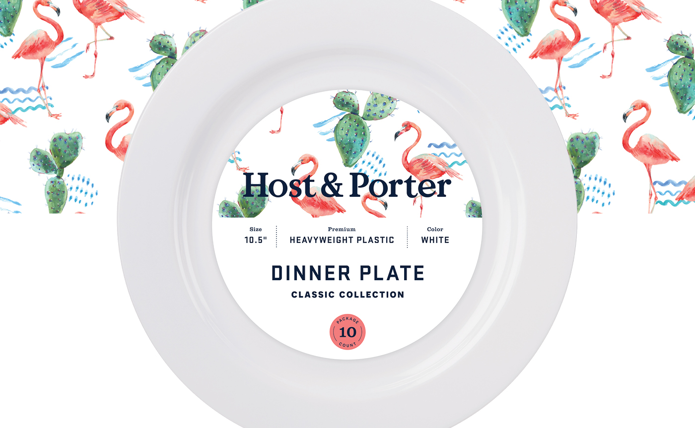
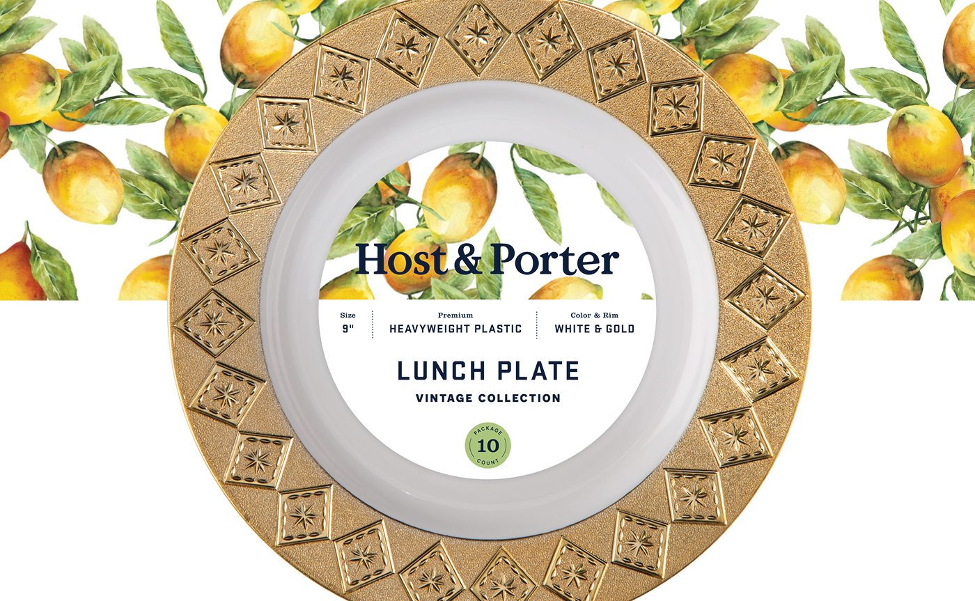
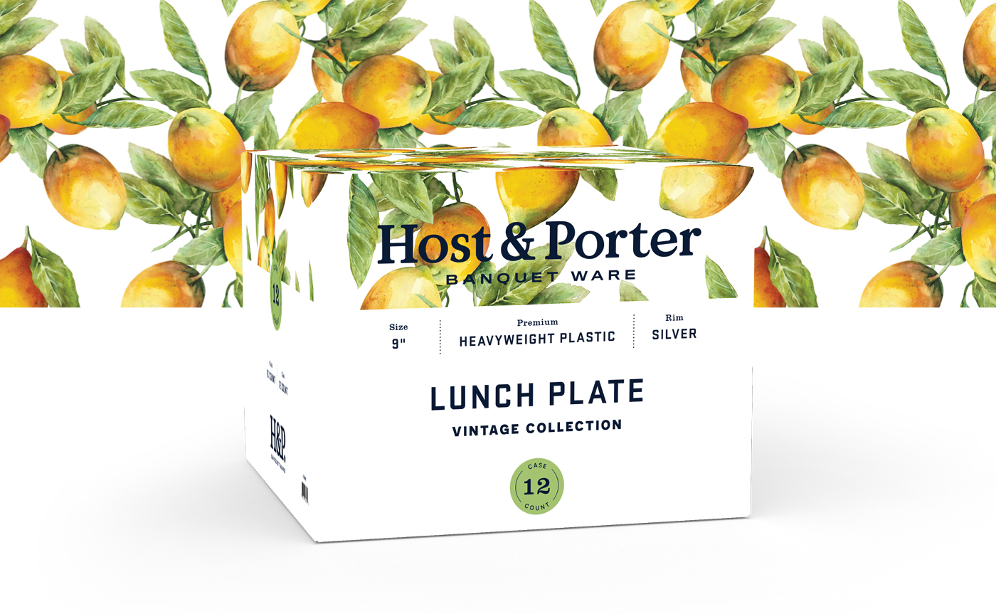
IDENTITY SYSTEM
lifestyle photography art direction
An appetizing take on disposable dinner ware.
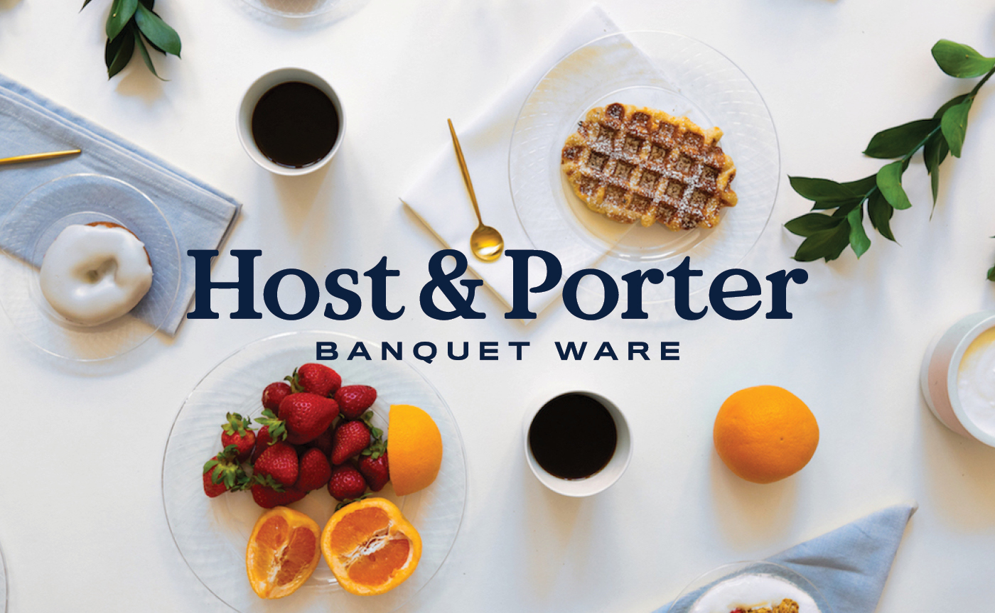
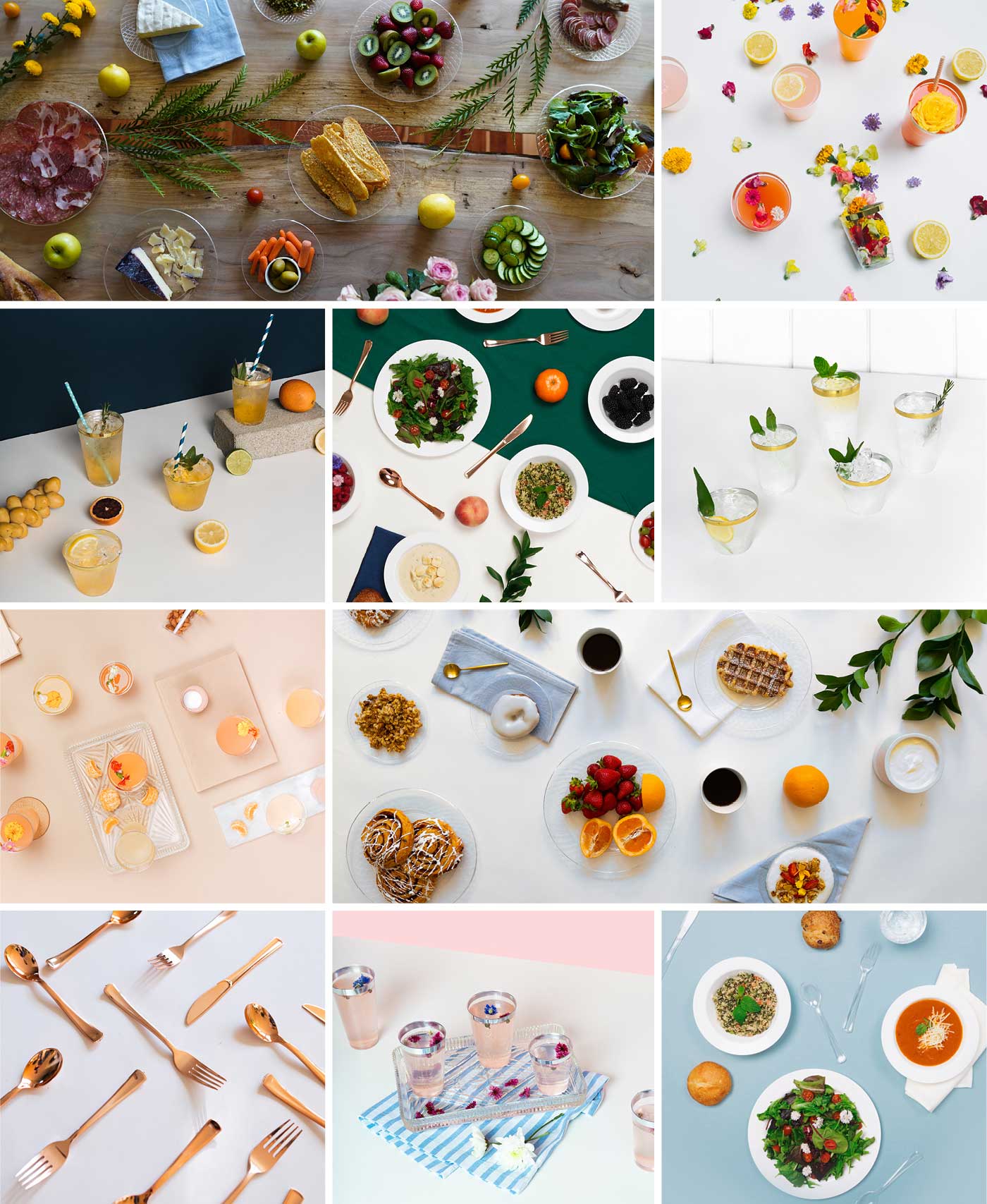
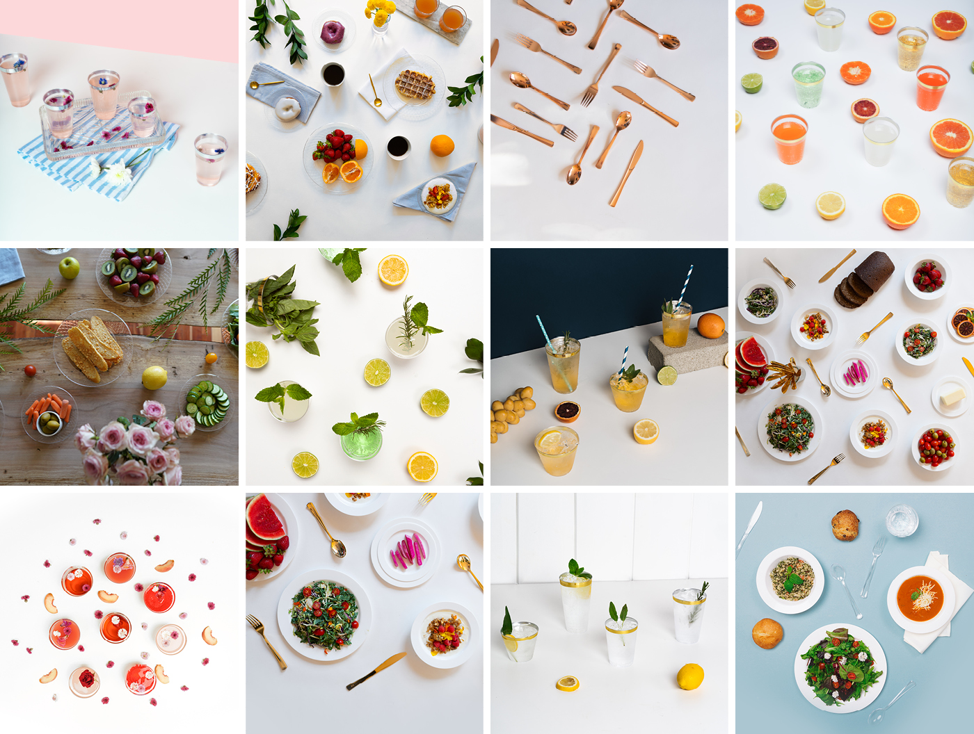
With the new name and strategy in place we pushed the brand forward with lifestyle photography. Working with Field Guide Co. we shot the products against a clean backdrop with table settings inspired by the beautiful patterns found in the brand. We then utilized the photographic elements across multiple platforms including website, marketing materials, and point of purchase sales.
LIFESTYLE PHOTOGRAPHY
copywriting direction
Giving Host & Porter a voice through copywriting.
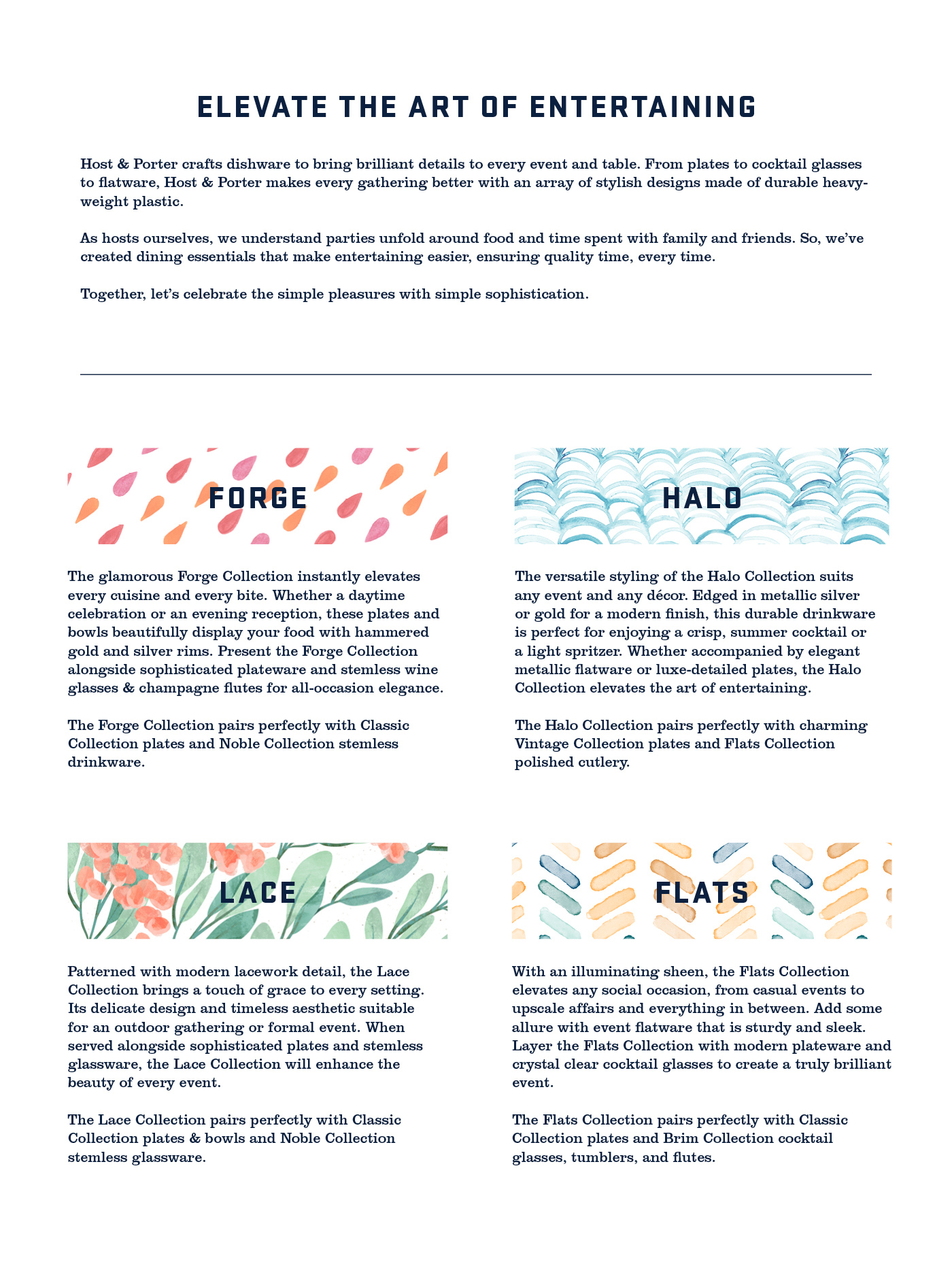
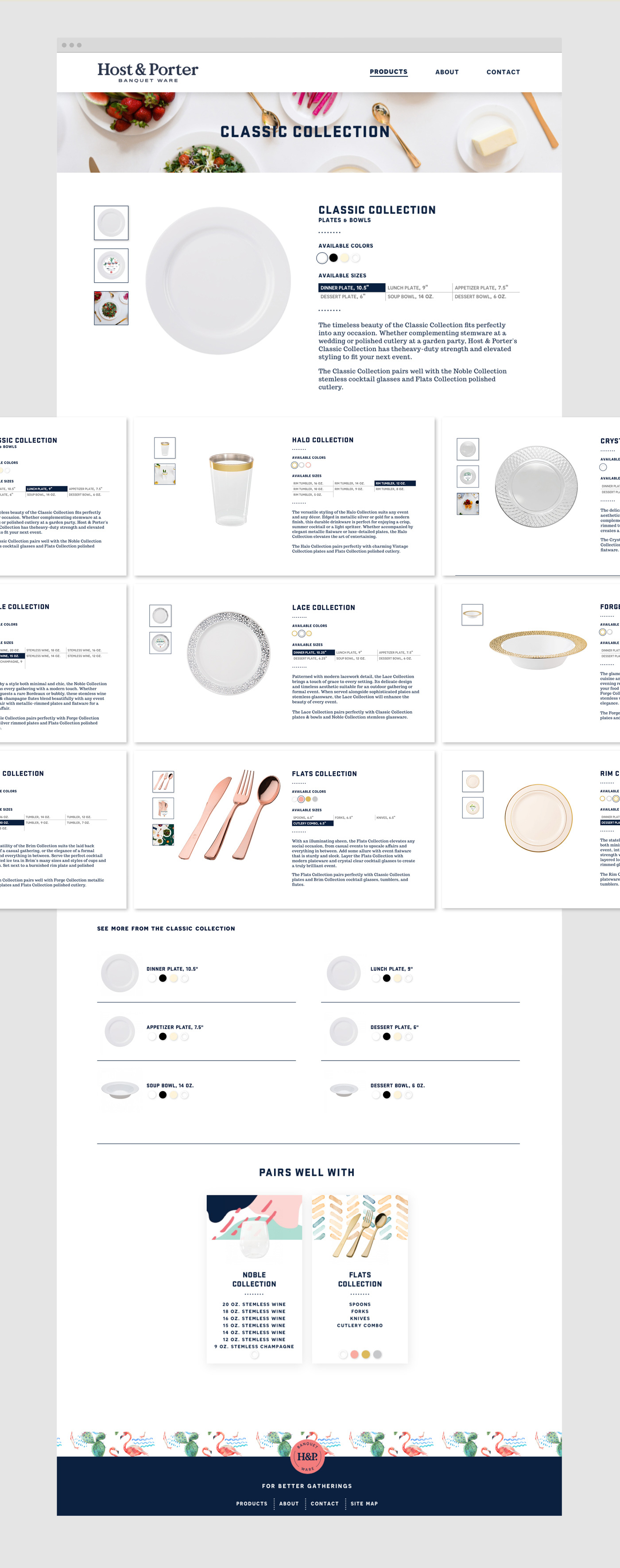
When developing the copywriting style for Host & Porter we wanted to match the sophistication of the brand and drive sales by recommending additional products. Each family was given a physical description, potential use, and recommended pairing. We then used the copywriting as a foundation for online ads and customer messaging to create consistency across all channels.
COPYWRITING SAMPLE
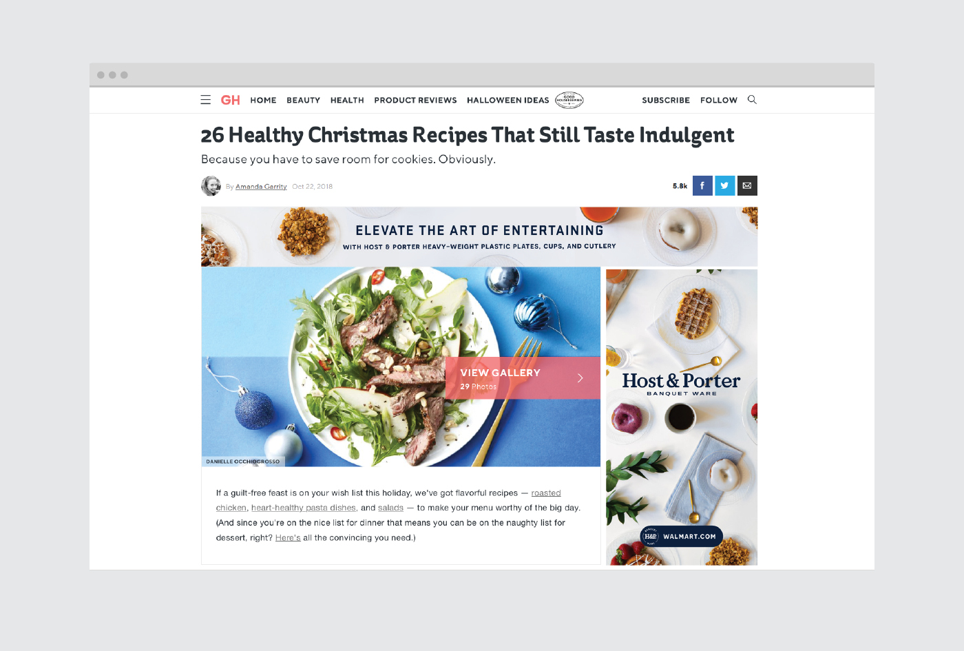
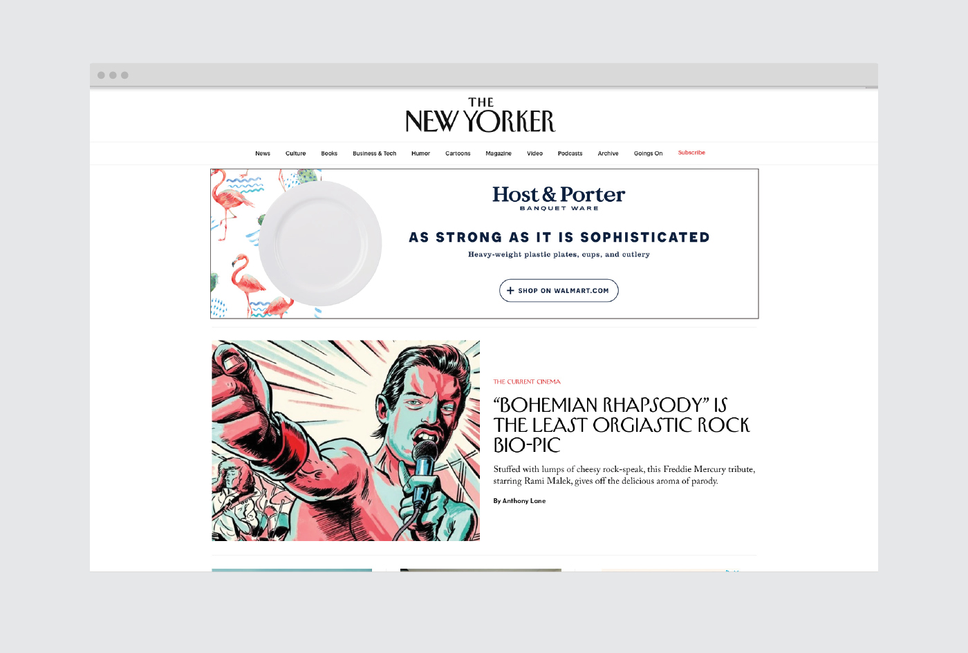
DIGITAL MARKERING STRATEGY
custom website
A custom front and back-end website solution.
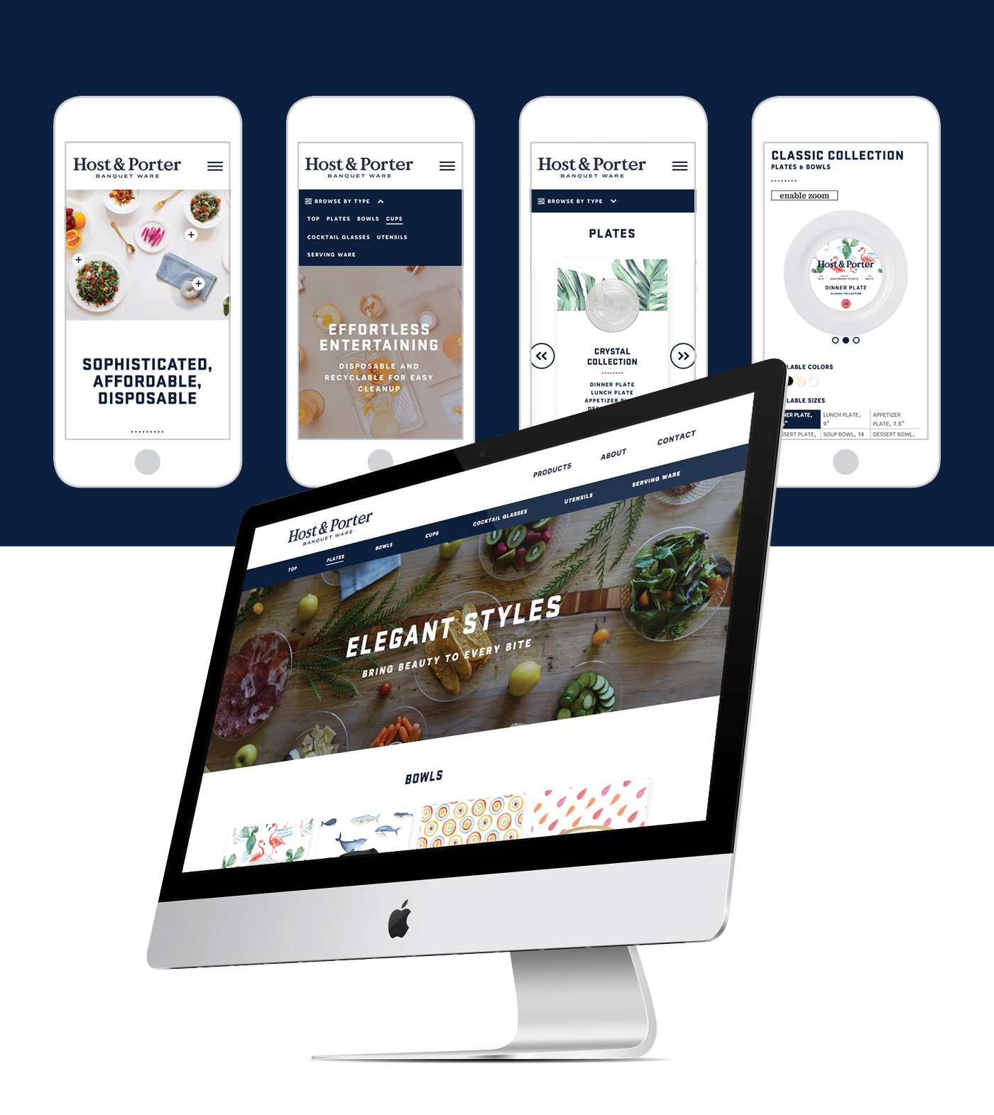
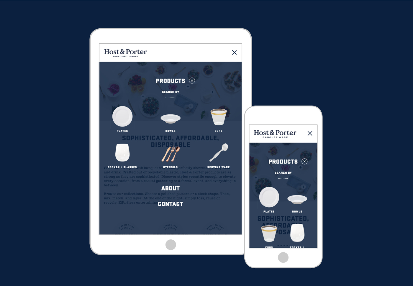
In keeping with H&P’s clean and intuitive design, we built a simple site for a complex task. We used large clear information balanced against lifestyle photography to create a site users will find easy to use.
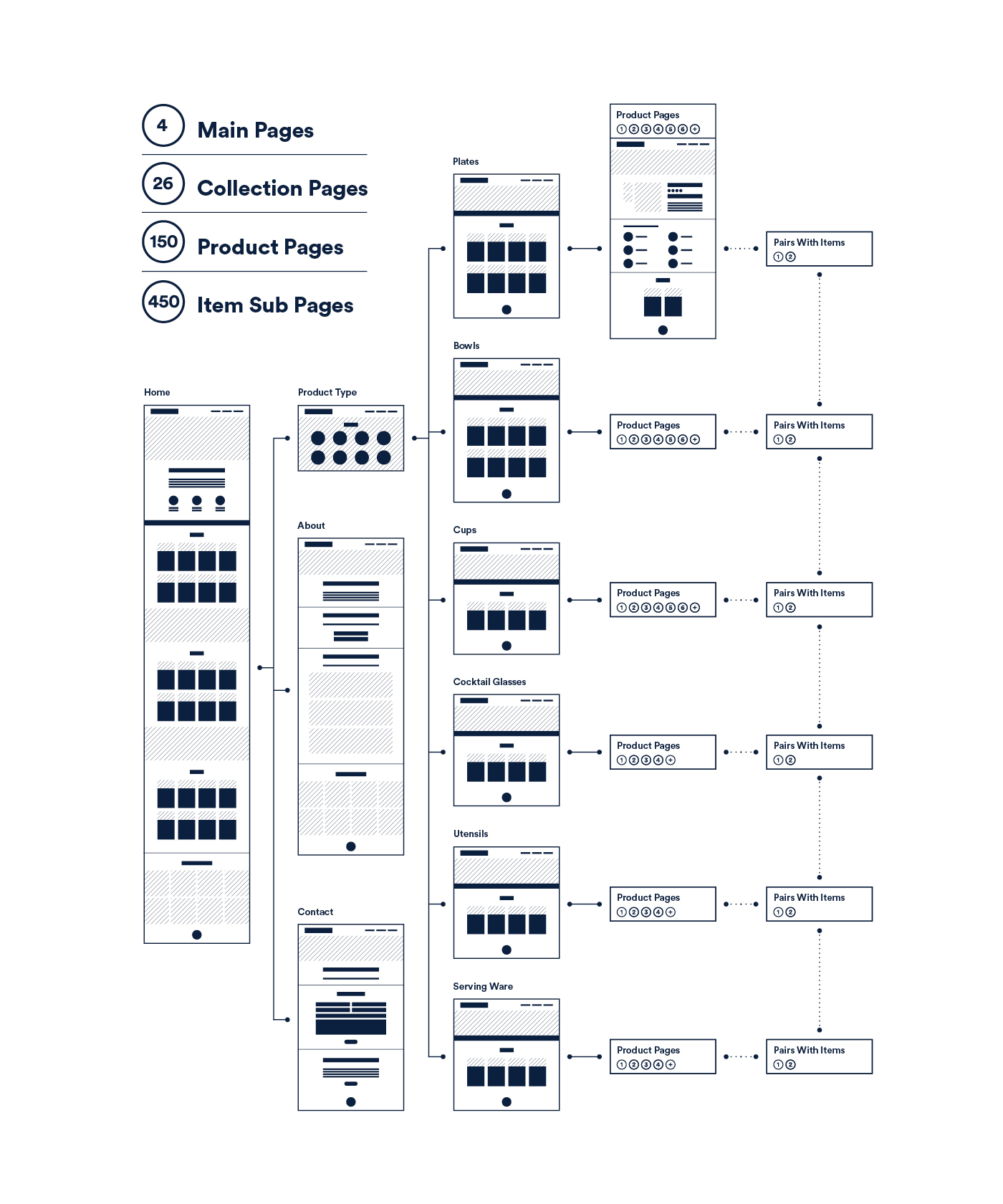
UX STRATEGY
CUSTOM WEBSITE

Engagement
Social media roll-out and online presence.
The newly branded Instagram account is populated with images of H&P products working together. This falls into the our photographic strategy of showing the product in a way that inspires people to share and garner inspiration for their parties or events.
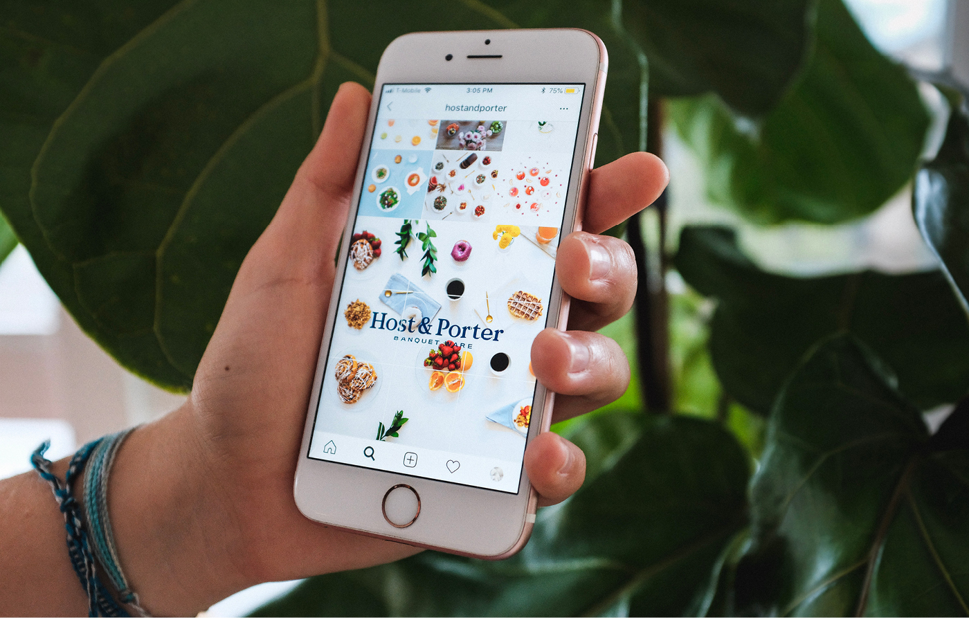
SOCIAL MEDIA POSTS
ASSET CREATION
Creating the elements for success.
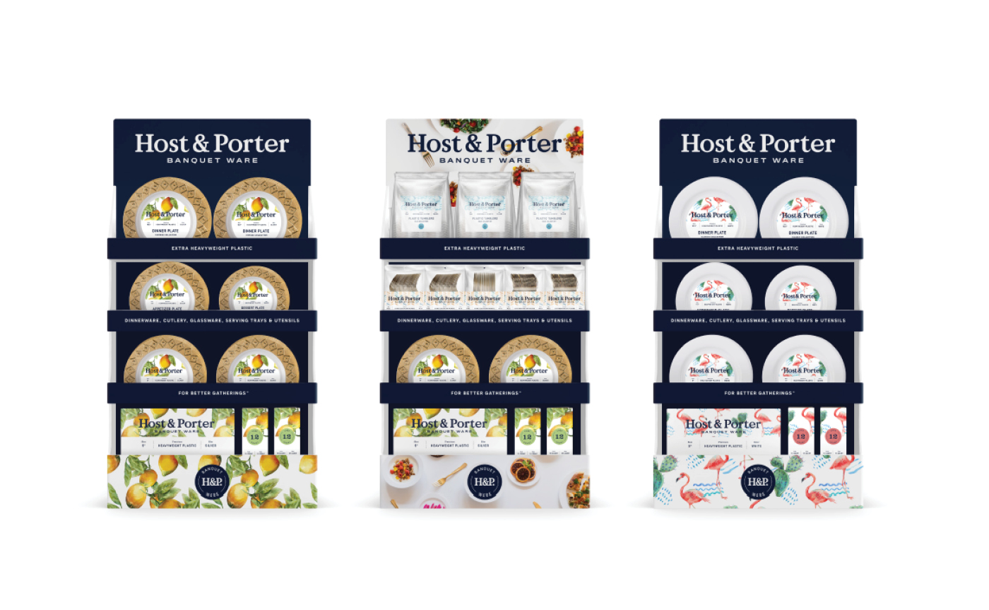
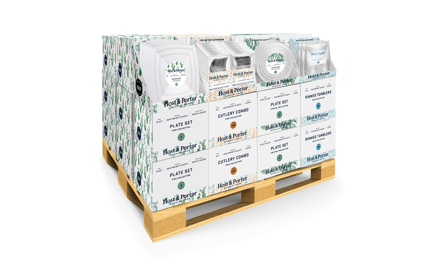
Putting together a beautiful core brand is only half the fun. Building the tools to communicate with retailers and gain new customers is achieved via pitch deck presentations, sales sheets, in-store displays and more.
SALES SHEET BOOKLET
END CAP DISPLAYS
