Client
Hathaspace
Experience Created
Brand / Packaging / Web
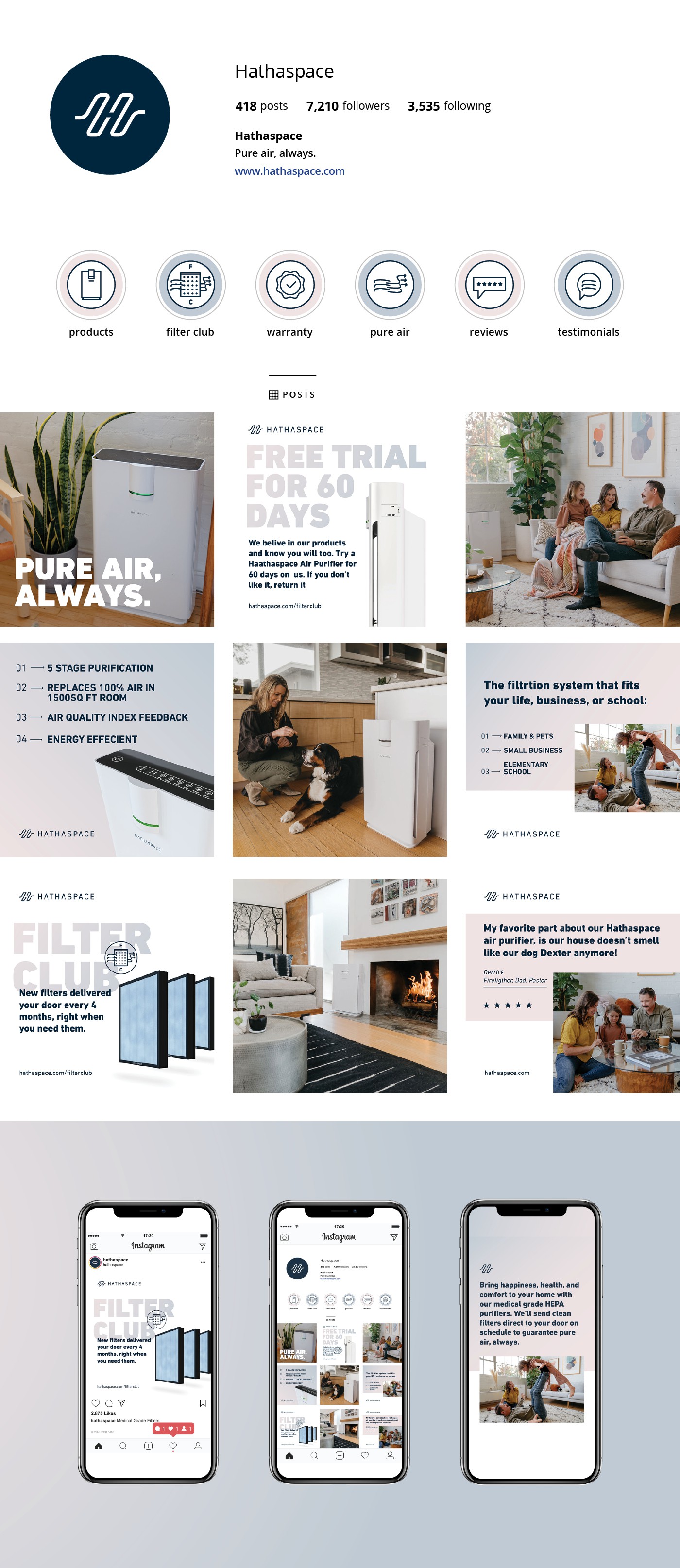
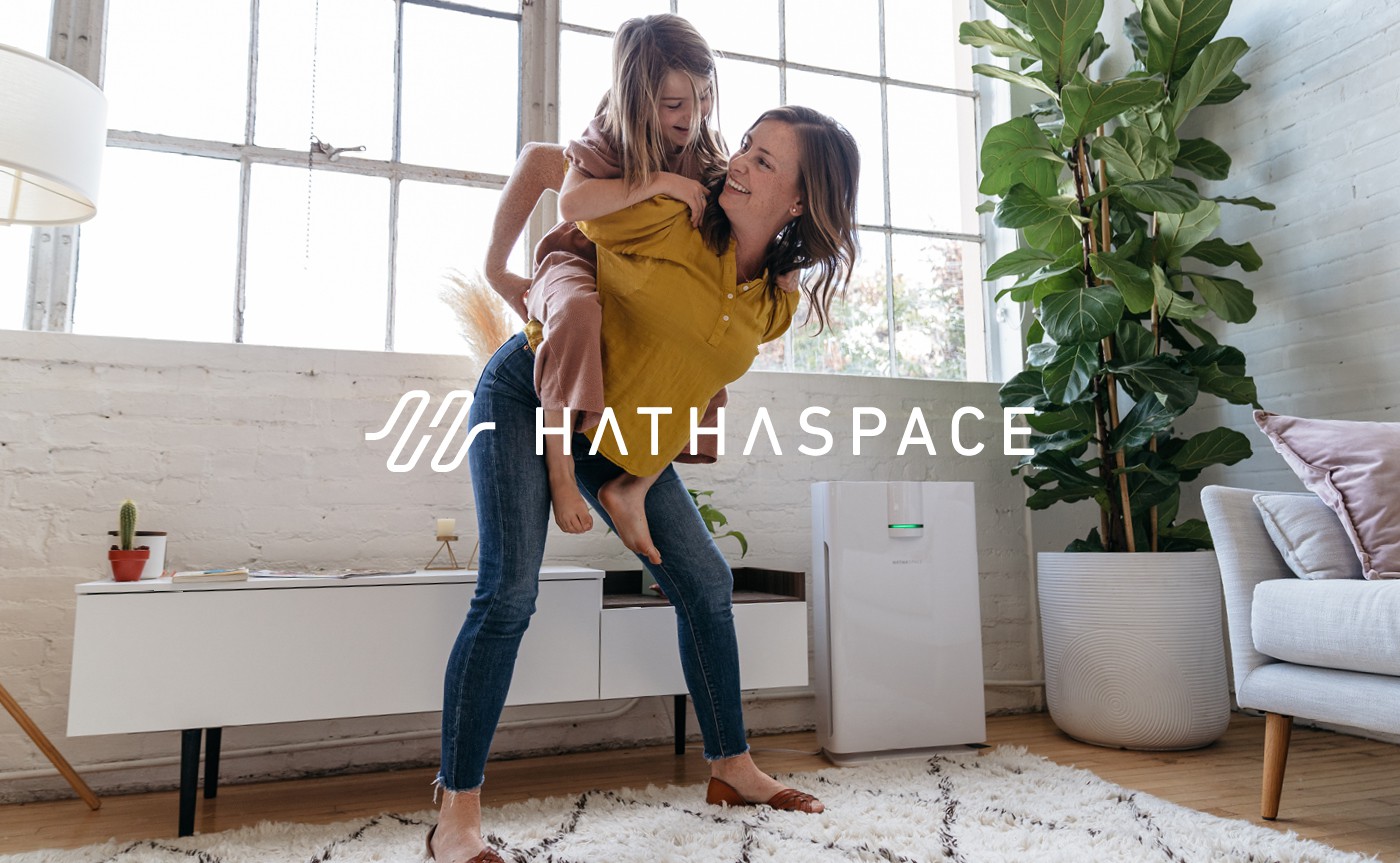
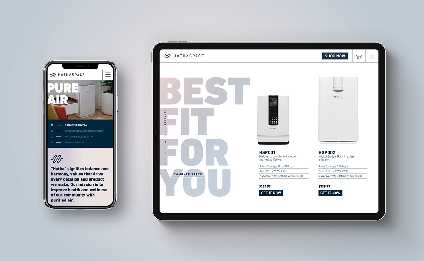
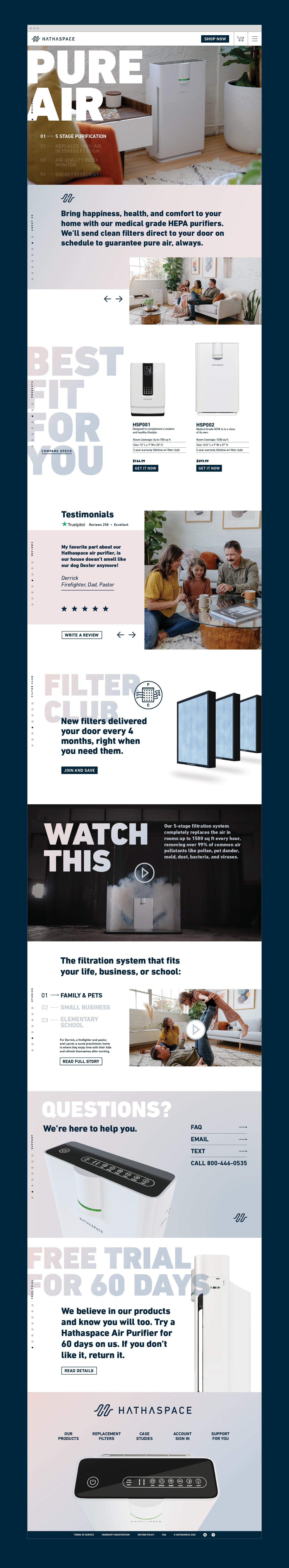
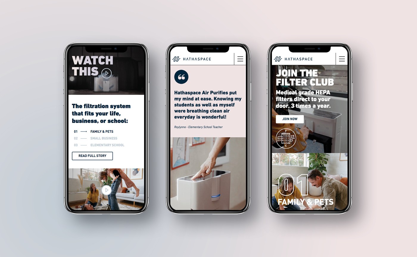
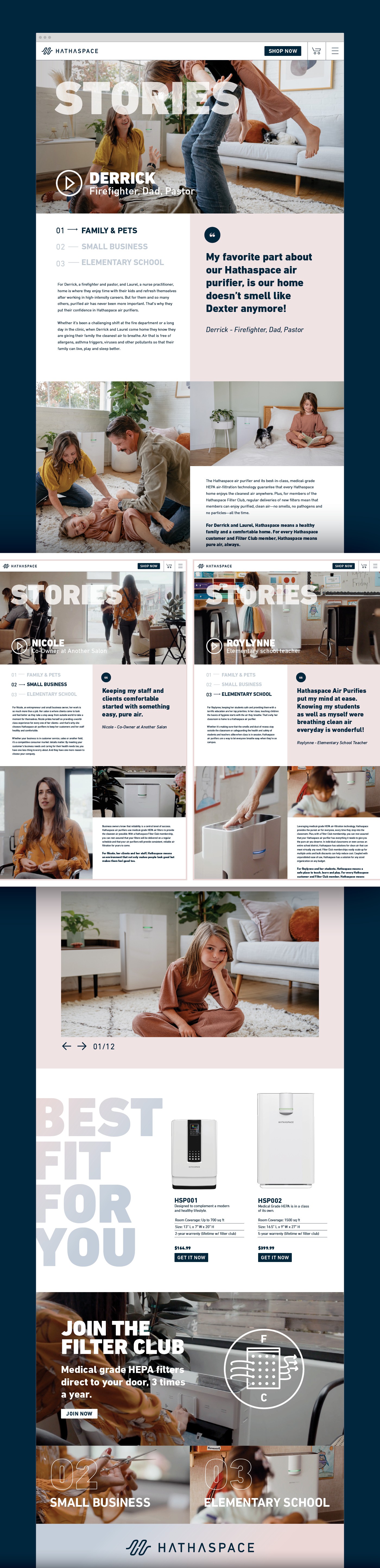
When Hathaspace reached out to us, the business opportunity was vast. The Air Purifier company was 10 months into Covid and the race to be the top on Amazon was on. The competition had early leads with heavy investment in scientific looking schematics and 3D videos of their machines, moving blades, micro pollutants swirling in the air, etc. Each company vying to outspend the other on the same look & feel. So we went the other way. The new Hathaspace brand is built around the people who use a Hathaspace Air Purifier and how it fits perfectly into their lives. By blending a trustable typographic system, soft color palette, warm photography, and down to earth messaging, Hathaspace now feels like a trustable national brand who understands their customers.
OLD IDENTITY

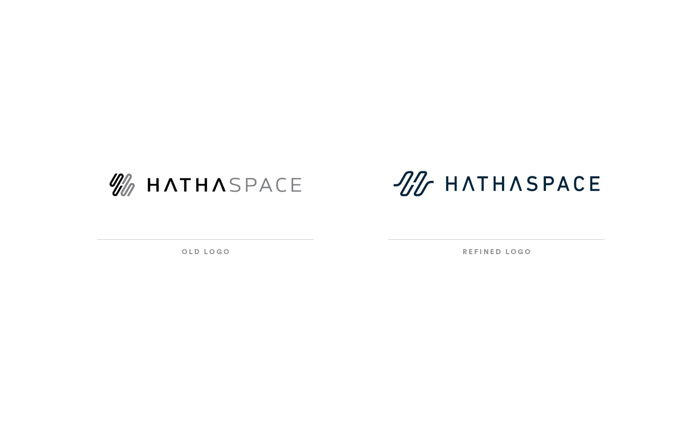
NEW HATHASPACE LOGO

NEW TAGLINE

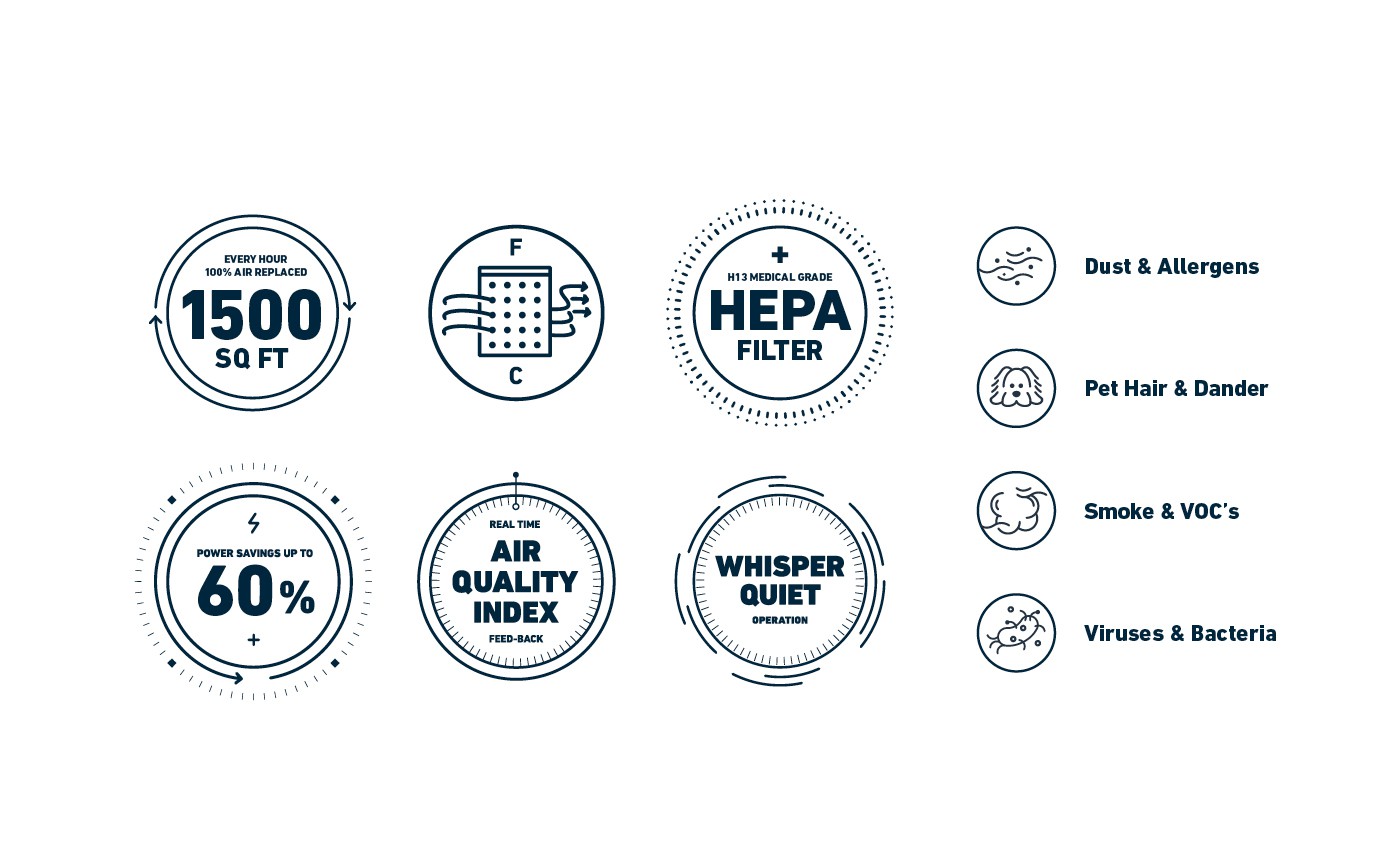
CUSTOM ICON + BADGE COMMUNICATION
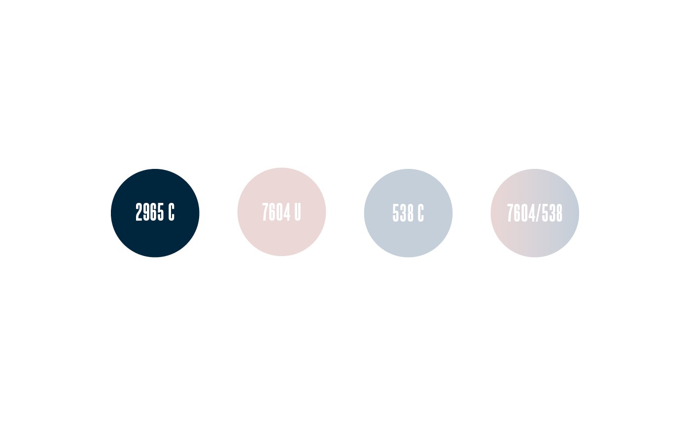
COLOR PALETTE
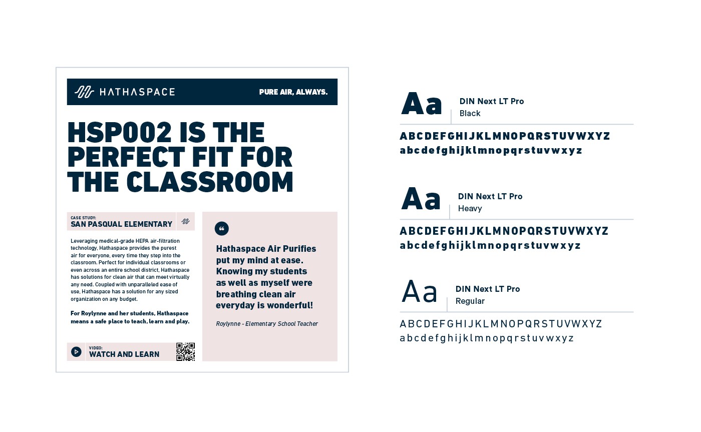
TYPOGRAPHY
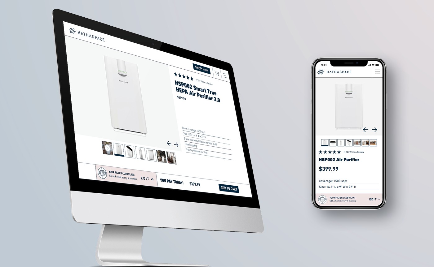
WEBSITE REDESIGN
Art Directed Campaign
Hathaspace at home commercial
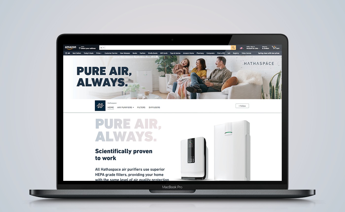
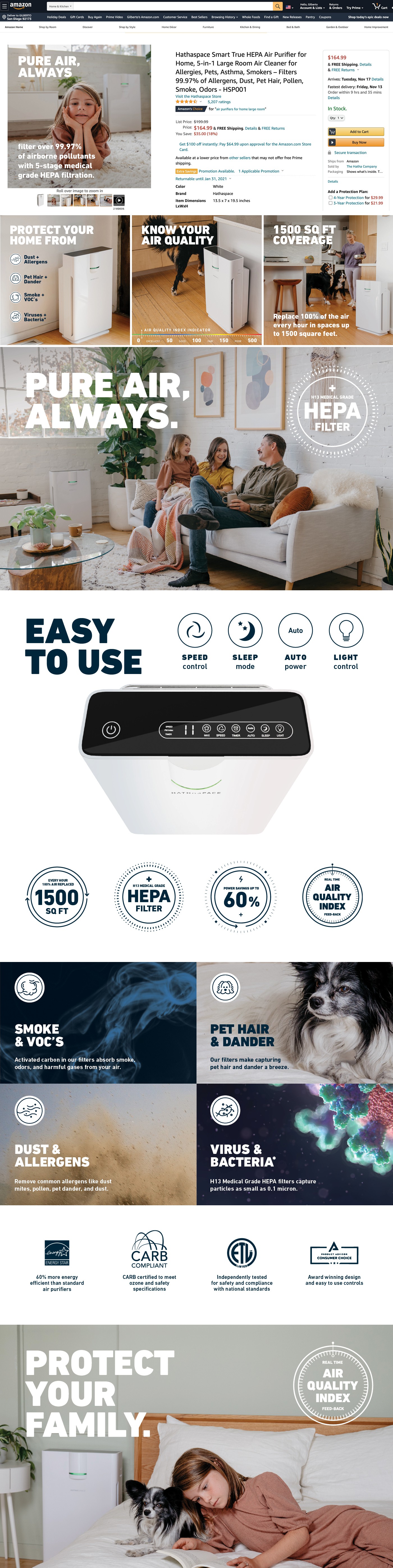
AMAZON STORE OVERHAUL
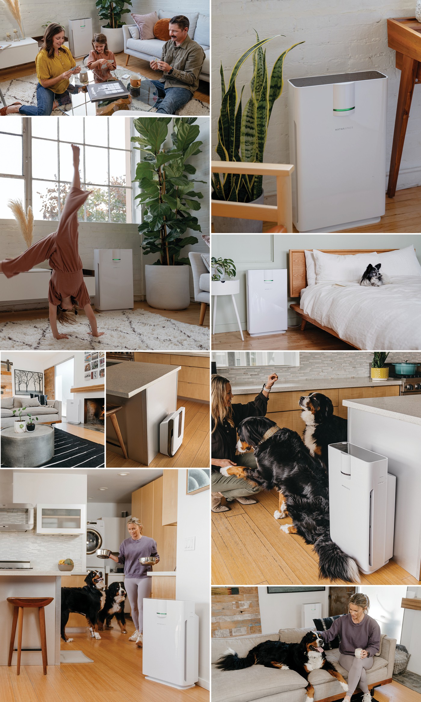
PHOTOGRAPHY ART DIRECTION
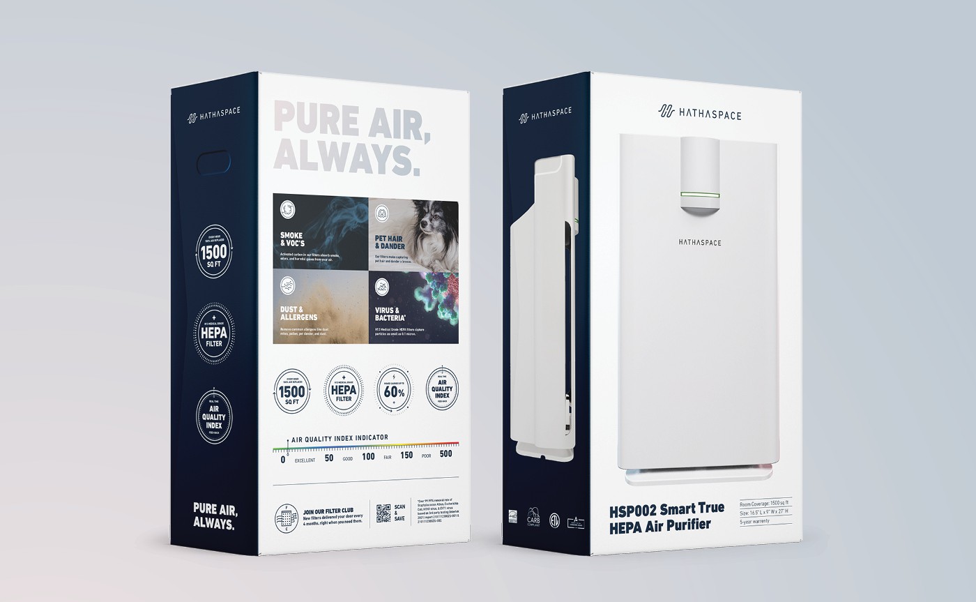
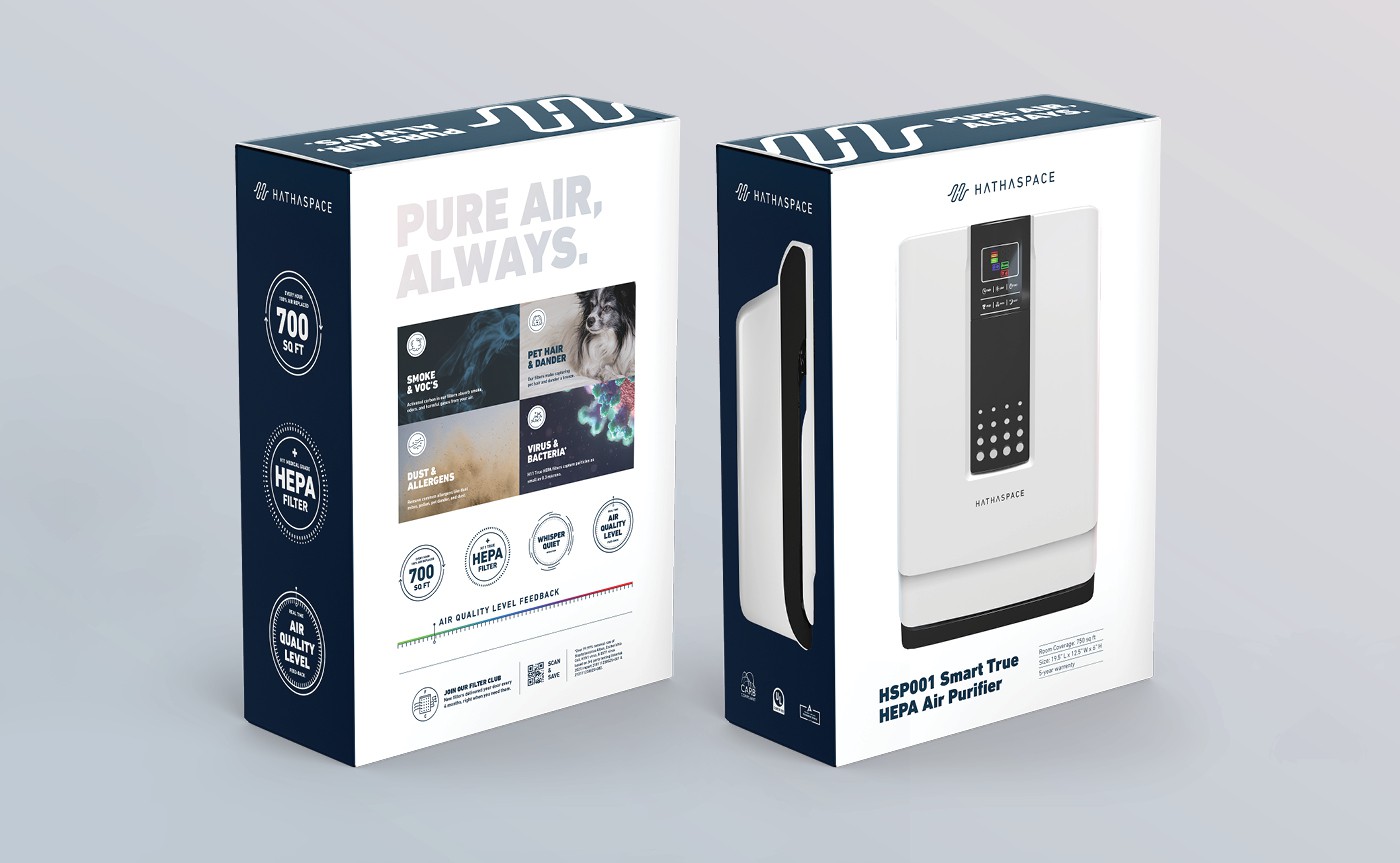
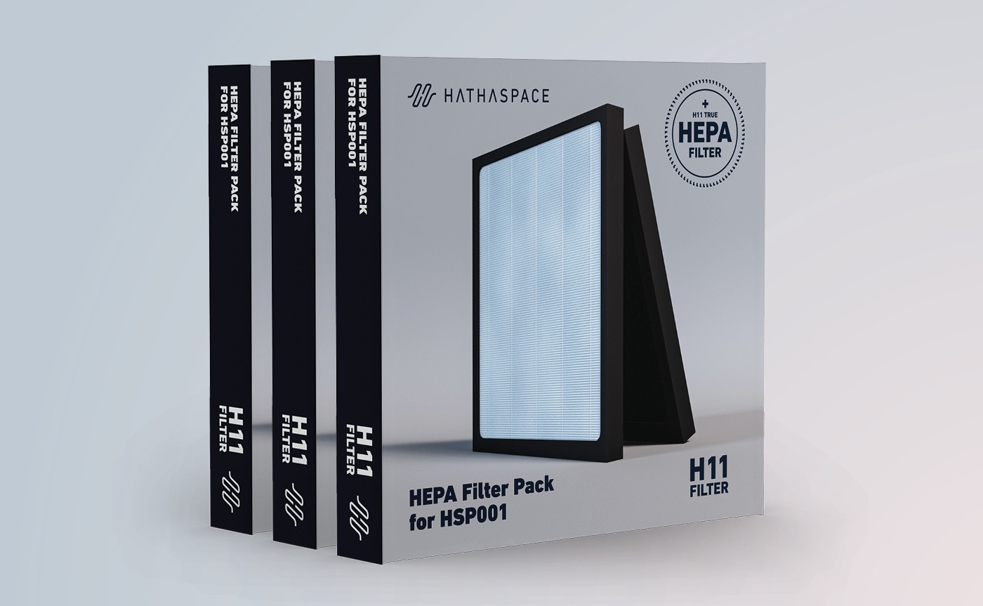
RETAIL DESIGN
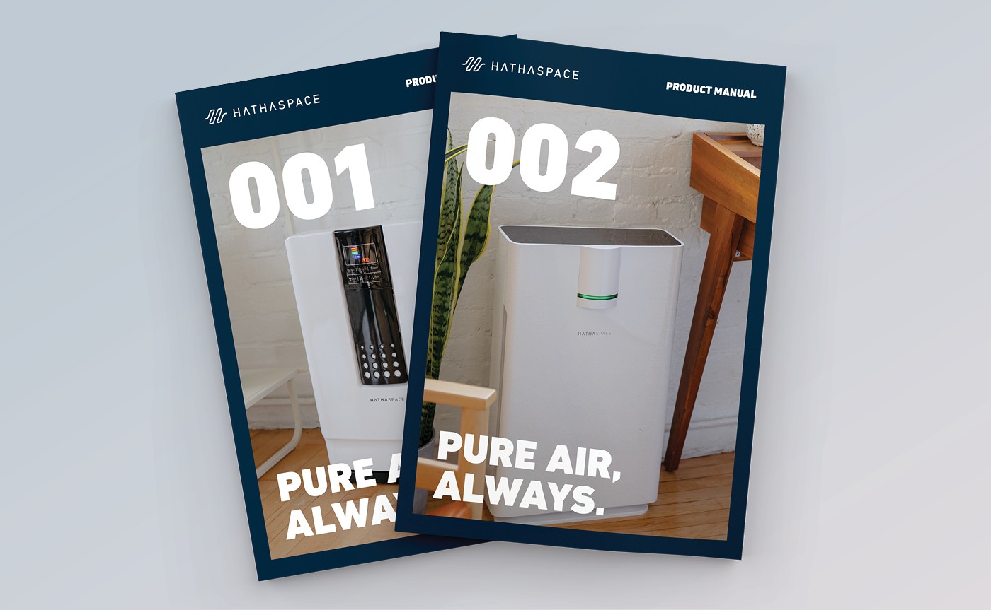
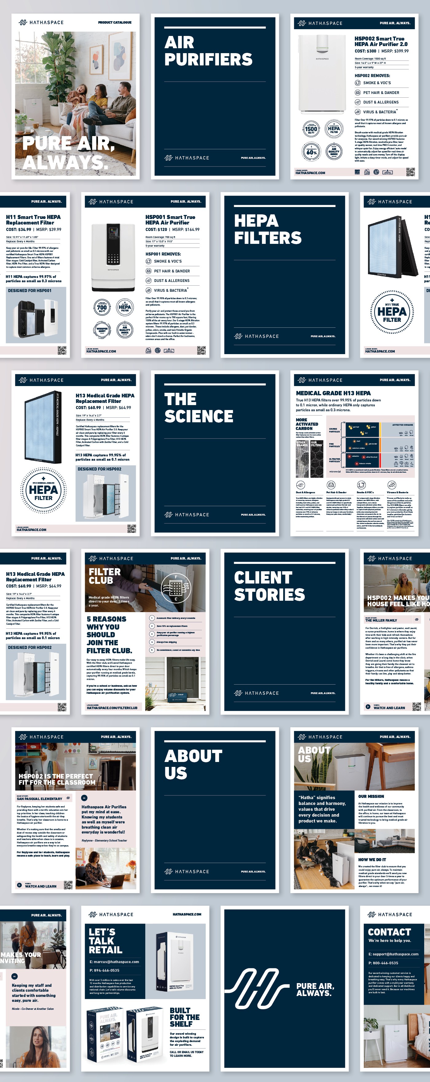
SALE SHEET BROCHURE
SOCIAL MEDIA